Hierarchy/Groups
In Visual KPI, Hierarchy refers to the organizational structure for categorizing and managing data elements. Similar to your computer's folder structure, it simplifies data navigation and organization, allowing you to rename and group different KPIs. For this reason, we use hierarchy and groups interchangeably to refer to the same feature. Also, the hierarchy organizes KPIs based on specific criteria defined by administrators.
Hierarchy helps separate KPIs for specific locations, making navigation easier. Objects can have multiple parents, and KPI groups can be automated based on conditions such as status or other criteria.
Hierarchy organizational structure
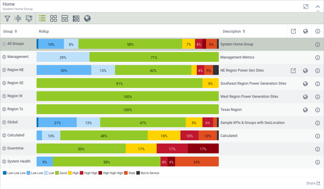
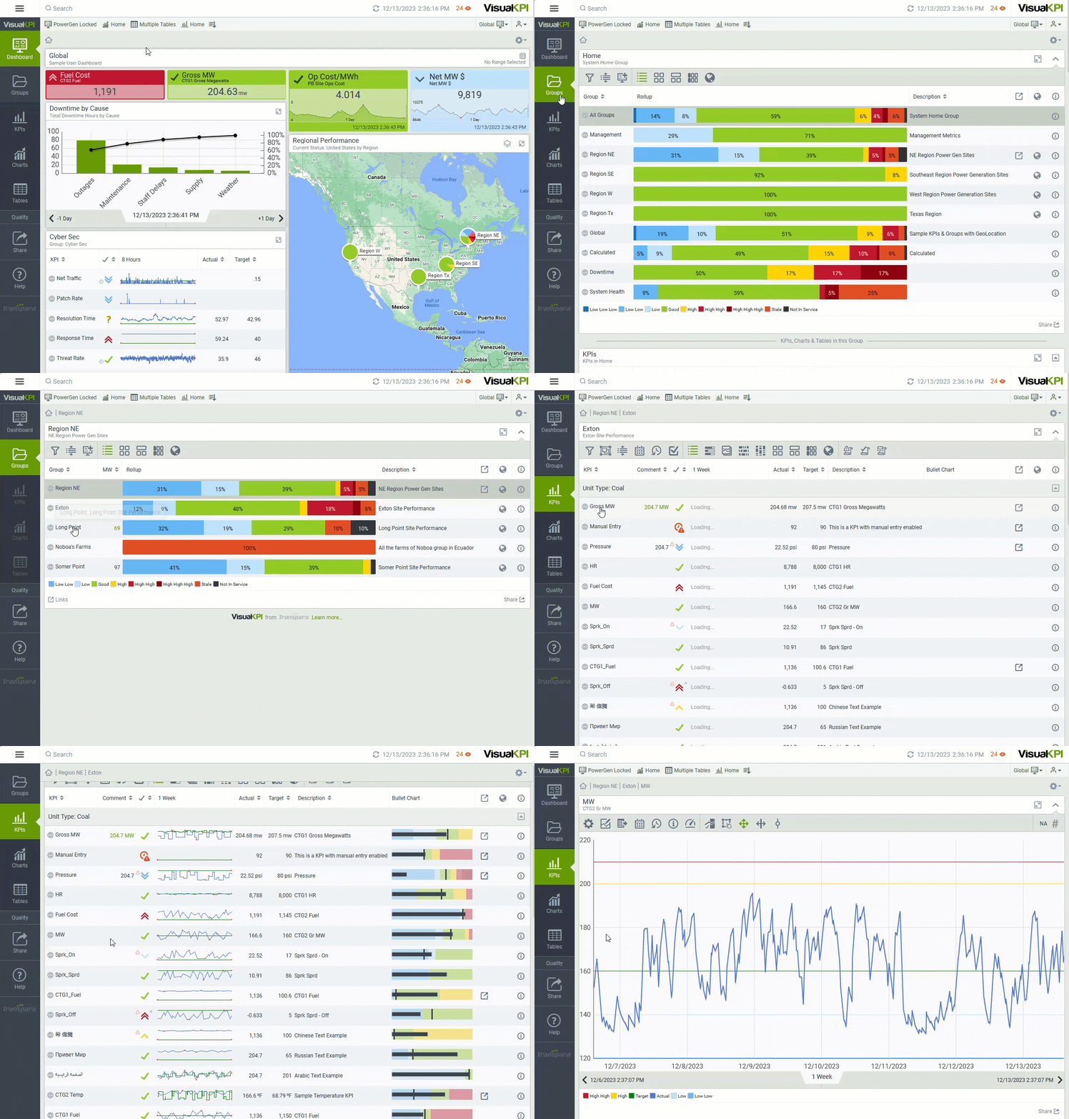
Visual KPI users interact with the software using profiles, dashboards, and hierarchical groups. This versatile structure offers automatic data aggregation, color-coded status indicators, and a quick performance overview.
Within this hierarchy, you'll find KPIs, Charts, and Tables that structure your data and a summary view to show aggregated information at higher levels. Automatic color-coding indicates data status, simplifying the assessment of KPI proportions in different states.

Regardless of quantity, groups in the hierarchy provide consolidated summaries of their contained elements. Users navigate through the hierarchy, exploring subgroups and accessing various data objects. In addition, groups adapt automatically based on attributes, ensuring organized and relevant data. It can be dynamic and automated based on attribute changes, making it a versatile system for data organization.

What's Next?
For more details on using the hierarchy and understanding its structure, you can access the End User guide.
Module six of Visual KPI training training addresses the hierarchy content in depth.