Hierarchy/Groups
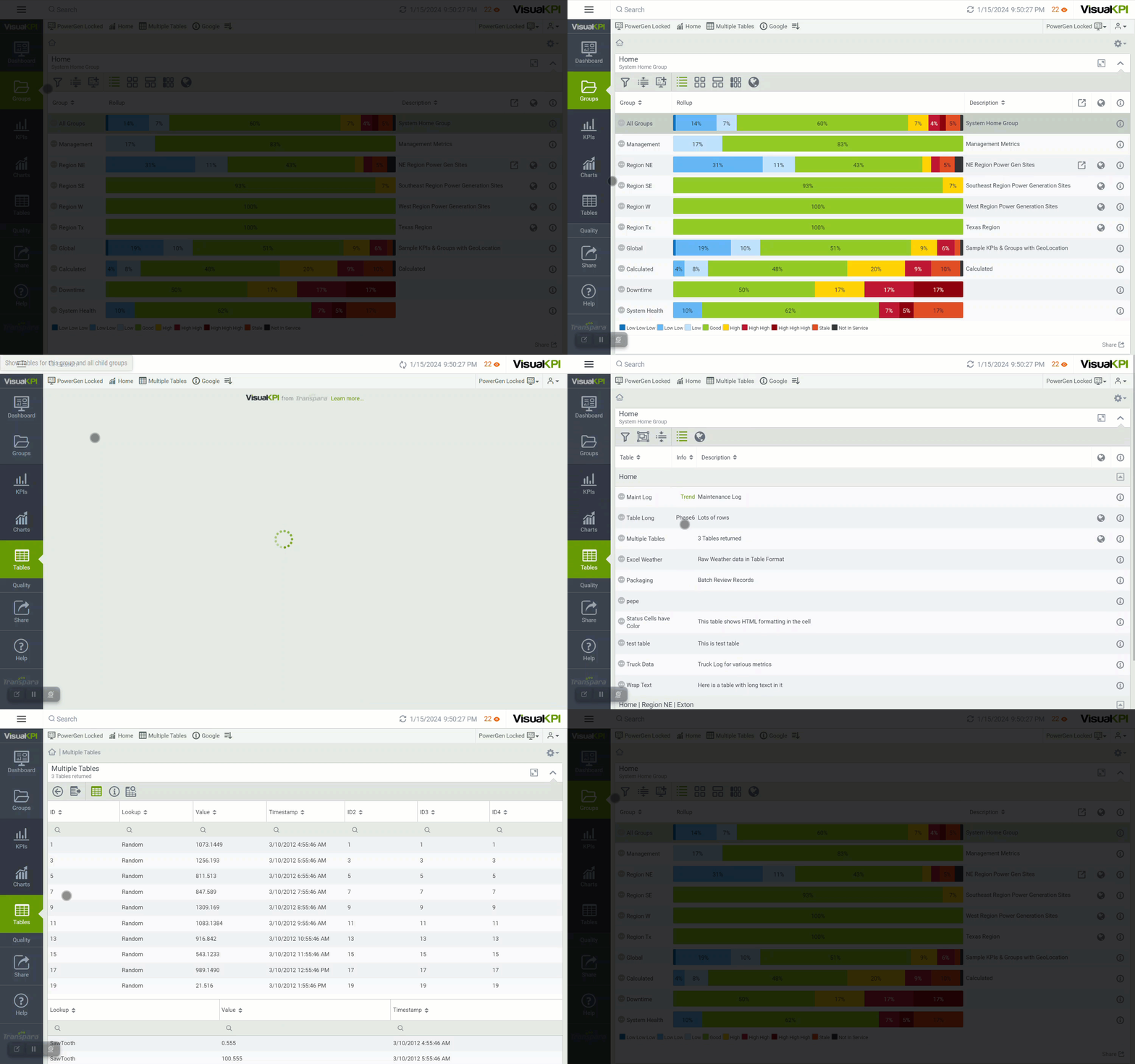
The primary navigation Groups page addressed how Groups work, just like folders on your PC, and that you can have as many groups as you want, with unlimited levels of groups containing multiple objects at any level of the hierarchy. Additionally, functions such as Drilling Down Through Groups, Breadcrumbs, and some visualization views are explained on that page.
Now, we will go deeper into the different types of objects that you can find in Groups. We will also explore more visualization options for your Groups to help you understand your data, leading to better decisions.
KPIs
The KPI tab on the Visual KPI main menu shows all KPIs at the level you are currently viewing. The default view for the KPI tab is the List View, which shows the KPI name, status, sparkline, actual and target values, a bullet chart, and details. In this view, KPIs can be filtered and grouped by status or attribute. All group views have analytics built right in.
Learn more about the other view options on our KPI Visualization page.
Charts
Charts show data as it relates to its defined limits. Visual KPI uses color to show status, and the chart includes marks for the target value, high and low limits. Visual KPI uses many chart types to visualize data in ways that make sense to you. Trends are just another type of chart with defined limits.
The Charts tab on the Visual KPI navigation bar displays any charts that are available at the group level you are currently viewing. For example, if you drill down into a sub-group, you'll see only charts for that sub-group, if there are any.
Not all Groups have charts. The Charts tab will disappear if there are no charts in the group (or its child groups) you are viewing. If the Charts tab is grayed out, there are charts in child groups, and you can click to see them.
Charts view
The Chart List View shows the chart's name, type, description, and a small visualization. You can use the Filters () and the Headers () to filter and sort your data. For more information, visit Filters.
The quickest way to see all charts available on your Visual KPI website is to click the Home icon (). It will take you to the top-level group. If there are any charts at the Home level, you can click the Charts tab to see them. To drill down further and see charts for all descendant groups, click Show Charts for this Group and All Child Groups ().
At the Charts tab, you can use a menu to interact with the chart or change the parameters. Use your mouse to scroll over the chart and see values or other information associated with the chart.
The menu will change depending on the type of chart you are viewing.

Tables
Any table retrieved from an SQL-based data source (SQL Server, Oracle, MySQL, Excel, Access, and more) can be converted into a Visual KPI Table. Your admin must set up tables in Visual KPI Designer.
Similar to Charts, the Tables tab on Visual KPI's main navigation menu displays any tables available in the group you are currently viewing, and it won't appear if there are no tables in the group or its child groups.
Tables view
You can configure multiple tables from the same data and add color and icons to your tables to highlight status based on the parameters you set. This allows you to create maintenance logs, shift reports, and error lists, or use any other tabular data you can access. Click Tables in the navigation bar and expand this list to see tables for all child groups available. To open any table on the list, just click on its name.
If you are in the Tables list view (), click the More icon () in any table to open a pull-down panel that shows some basic information about the table. If you click the View Full Table Details icon (), it will open the System Configuration Details screen. This gives you detailed information about the table configuration set up by your admin in the Visual KPI Designer.

You can add tables to your Dashboard, as any other object. You can resize the Dashboard Table object if your table is too large. This way, the table will be displayed with a limited number of lines, enabling the user to scroll down to view the remaining data.
In summary, the Visual KPI Table allows you to:
- Visualize any tabular or rectangular data.
- Visualize time-series or non-time-series data.
- Use time ranges/filtering and scroll forward or backward in time.
- Use query-based.
- Perform searches in entire tables or individual columns.
- Use HTML content.
Tables data
Visual KPI provides several operations you can perform with table data, which are listed below:
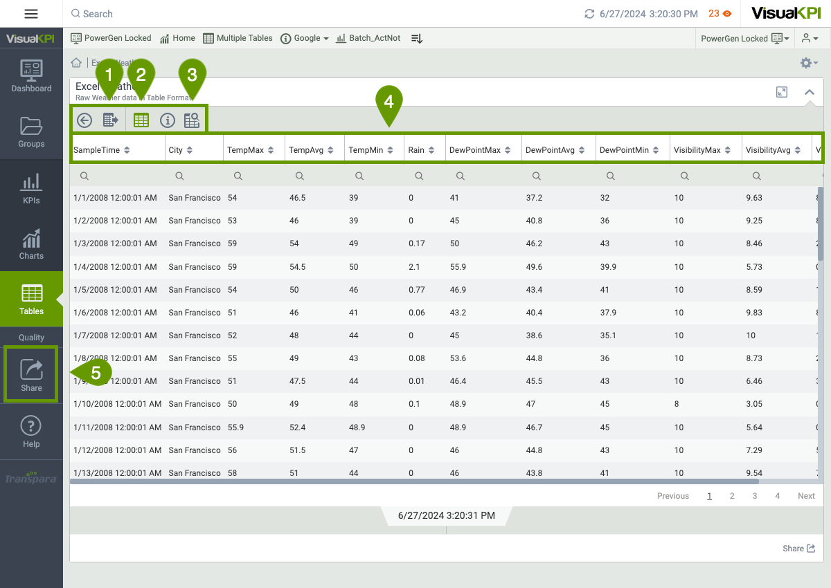
- Use the Export to CSV () to export table data for further analysis.
- View the raw data from a table by clicking the View Table Data ().
- The Search Table () option allows you to search for anything within the table. This is especially useful for tables with lots of data. You can also search Table columns by clicking at the top of any column to search based on the information in that column.
- Sort raw table data using the Headers () to sort by any column. Once you have sorted by a single column, you can sort by a second column by holding down the shift key and clicking on the second column you wish to sort.
- Share tables using the Share () tab.

What's next?
To become a Visual KPI pro user, visit our Visualization page to learn the best view features for your analysis and KPI monitoring.