KPIs
KPIs are used to keep track of any information that serves as a metric that indicates the performance of critical activities within a company. They're essential for decision-makers, providing insights into performance trends and guiding strategic adjustments.
Actual is the current, real-time value of the KPI, and Target is where you want it to be.
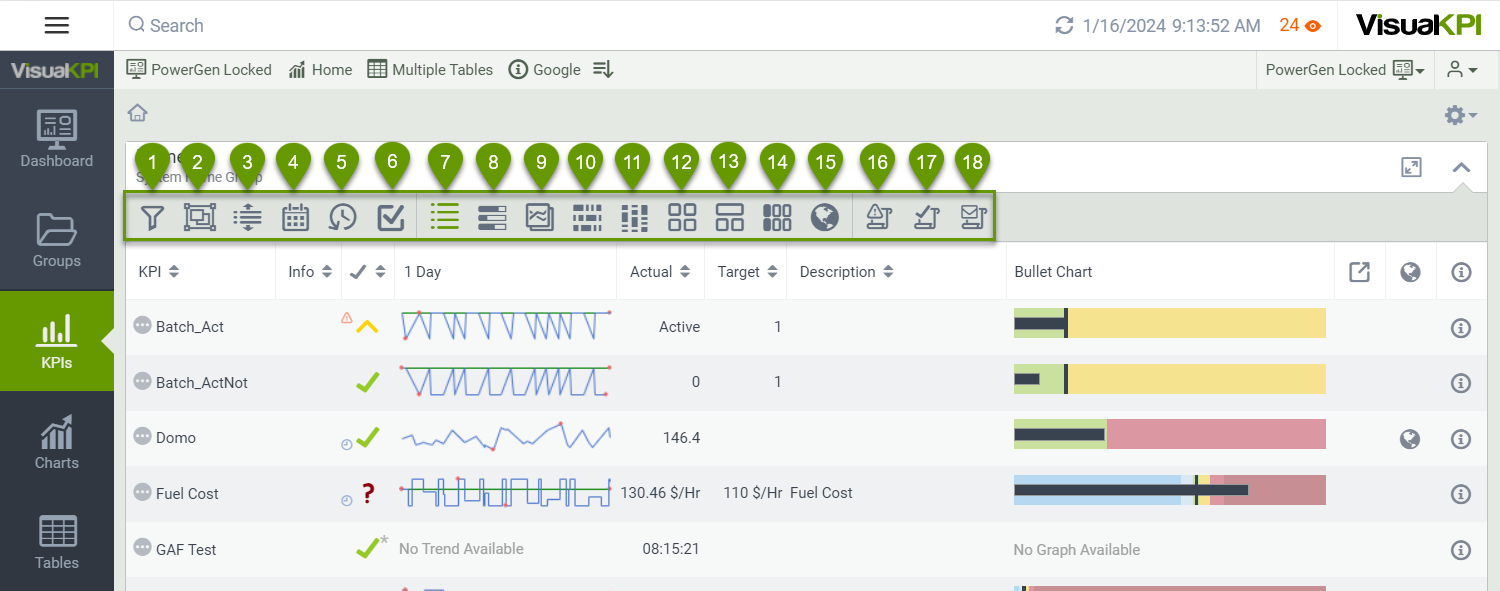
When you click in the KPI tab, you see the following options on the top bar:
- Filter (): Filter by status or distance from the location where you are.
- Grouping (): Allows you to group your KPIs by Standard or Custom Attributes such as Status, Group, or any other that makes sense for your organization. Your admin can configure Custom Attributes.
- Only Show Descendant/Child Groups (/): Show all child items of the Group you are currently viewing or collapse the list to go to the top level of the current list.
- Time Ranges (): Configure a Time Range for all your KPIs. It is especially useful when using Trend View to compare values.
- Revert (): Return to the default KPI view.
- Select KPIs (): Select multiple KPIs by clicking the boxes that appear to the left of the KPIs in the list.
- View as List (): This is the default view in the Group view. If you changed the view, click this icon to return to a list view.
- View as Bullet Chart (): It is similar to the KPI List View and Status History view, but the KPI Bullet Chart view focuses on the current status of the KPI relative to targets and limits.
- View as Trend List (): Present the KPIs as trends so you can quickly compare the KPIs values from your Group.
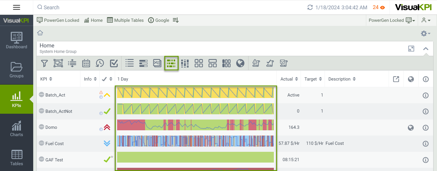
- View as Status History Chart (): Projects vertical color bars to show Highs and Lows or other targets based on status color.
- View as Status History Map (): Similar to Status History Chart, but you can see a status history chart in the trend view. Click the Status Background icon to activate the background.
- View as KPI Map (): KPI maps, if configured by your admin, show a heat map of all the KPIs in the level you are currently viewing.
- View as Group Map (): Shows a bar across the top of each Group to indicate the status of the Group as determined by the Group Map settings.
- View as Group Map Table (): Similar to the Group Map View, it shows the groups as titles in a table.
- View as Geo Table (): The Group Map view is similar to the KPI Map but gives each Group its status.
- View Status Summary (): This shows you a summary and history of your best and worst KPIs at the group level in Pareto chart form.
- View Status History (): This shows you the relative performance of the selected KPIs grouped into the various status options.
- View Notification History (): See how many times the system sent notifications for alert status KPIs.
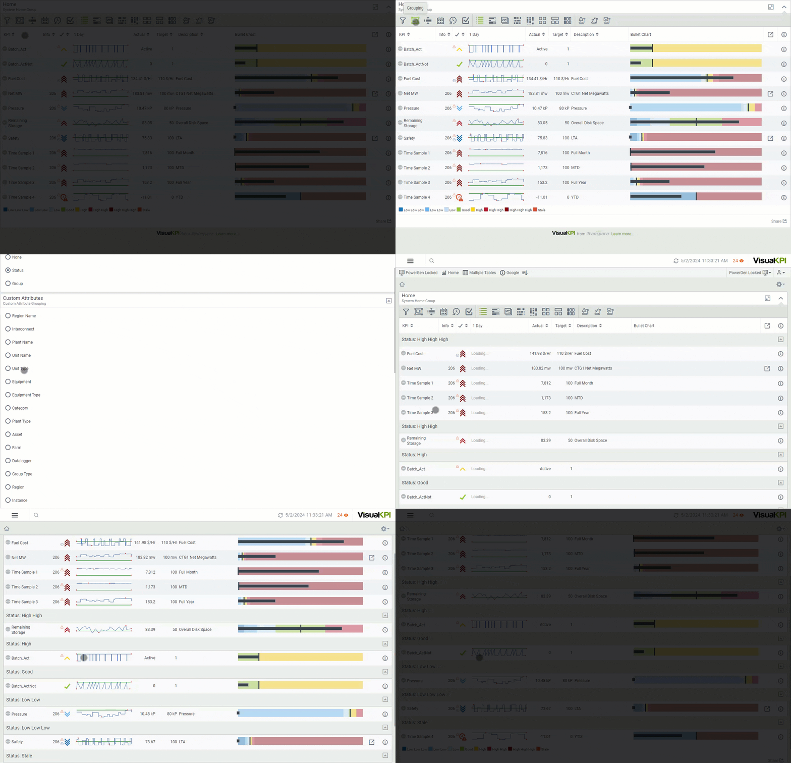
Grouping
Click the Grouping icon () to group your KPIs. You can group your KPIs by Standard attributes, such as Status or Group, or any other that makes sense for your organization through Custom attributes. Your organization's admin configures the Custom Attributes.
The example below presents the KPIs grouped by status, which allows KPIs with equal status to be displayed together. This option is valuable if you want to quickly check all the KPIs with similar characteristics, such as those with HighHighHigh status.
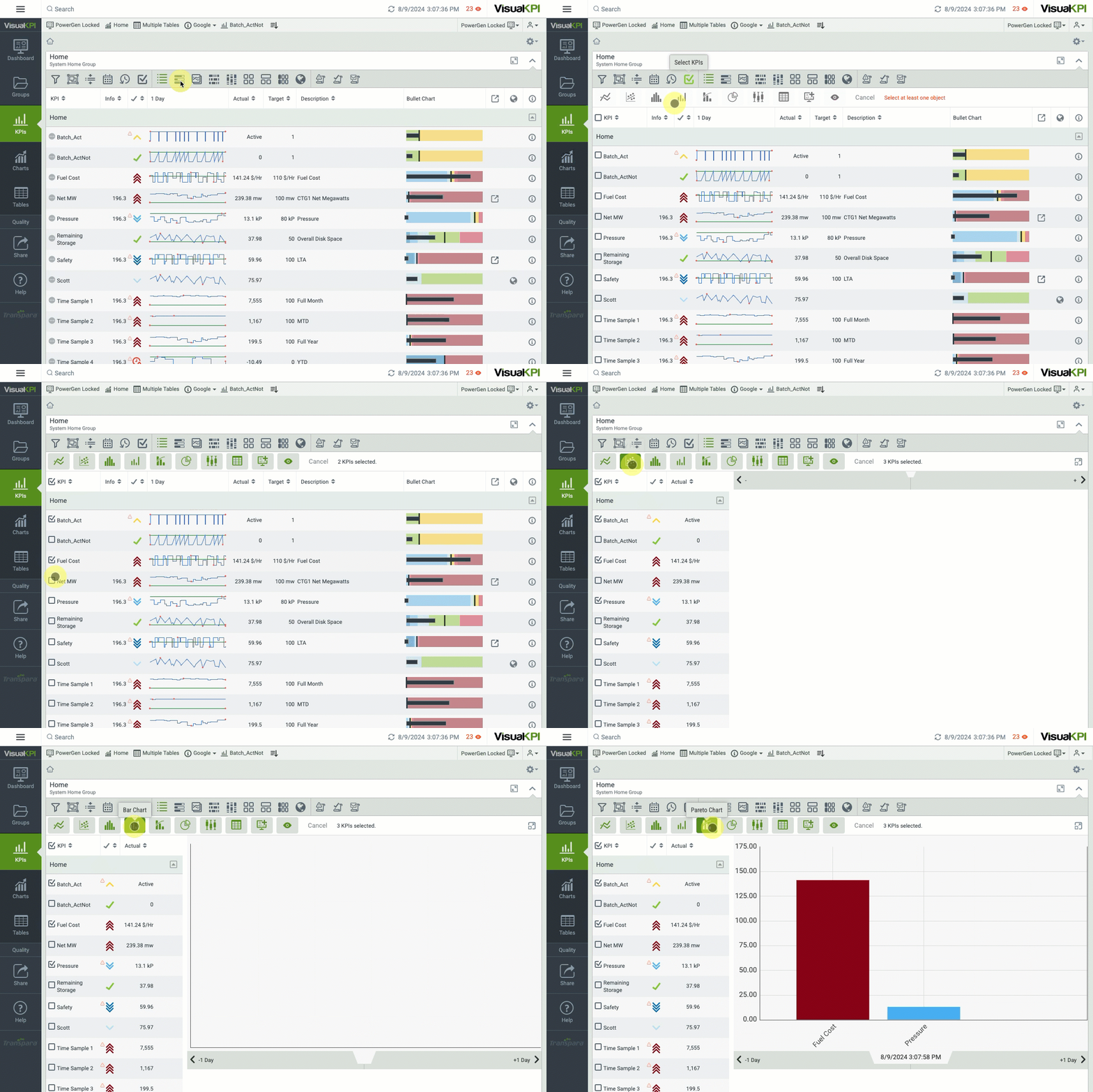
Select KPIs
Click the Select KPIs icon () to select multiple KPIs form the list. You can then select which visualization you wish to see those selected KPIs in. You can also add or remove KPIs after selecting a visualization. However, at the moment the visualization does not update automatically when you add or remove KPIs in the selection, so you will need to click the desired visualization again to refresh it and reflect the new selection.
View as a Bullet Chart
The KPI Bullet Chart view () is similar to the KPI List view () and Status History view (). However, the KPI Bullet Chart view focuses on the current status of the KPI relative to targets and limits. The KPI Bullet Chart view is optimized for mobile, so comparing peer KPIs at a glance is easy.
When you select the Bullet Chart, new options are available if you use the Grouping () function. For the Bullet Chart view, you can group using the Standard and Custom Attributes, but you also can choose to group by Bullet Chart type:
- Default
- Actual EU (Engineering Units)
- Deviation EU
- Deviation %
Each KPI in the Bullet Chart View requires specific configuration details to ensure accurate representation. At a minimum, each KPI must have at least one defined limit. However, to fully utilize the capabilities of the view, you should define both minimum and maximum values. These values represent the expected range of the KPI and help identify anomalies. For example, a KPI measuring available disk space should never be able to show a negative number or a number larger than the size of your disk.
The example below presents how to read the bullet chart using the default view.
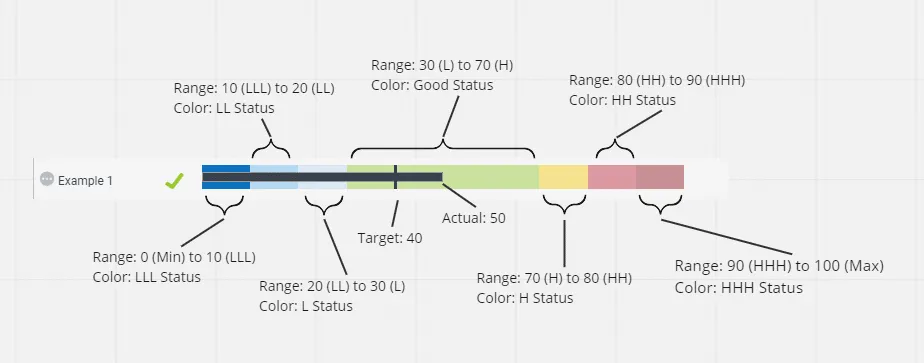
In contrast, the example below shows Bullet Charts using the Deviation % view, which centers on the target and shows which KPIs are deviating from their target by a significant percentage. The bigger the black bar, the more the KPI deviates from the target.
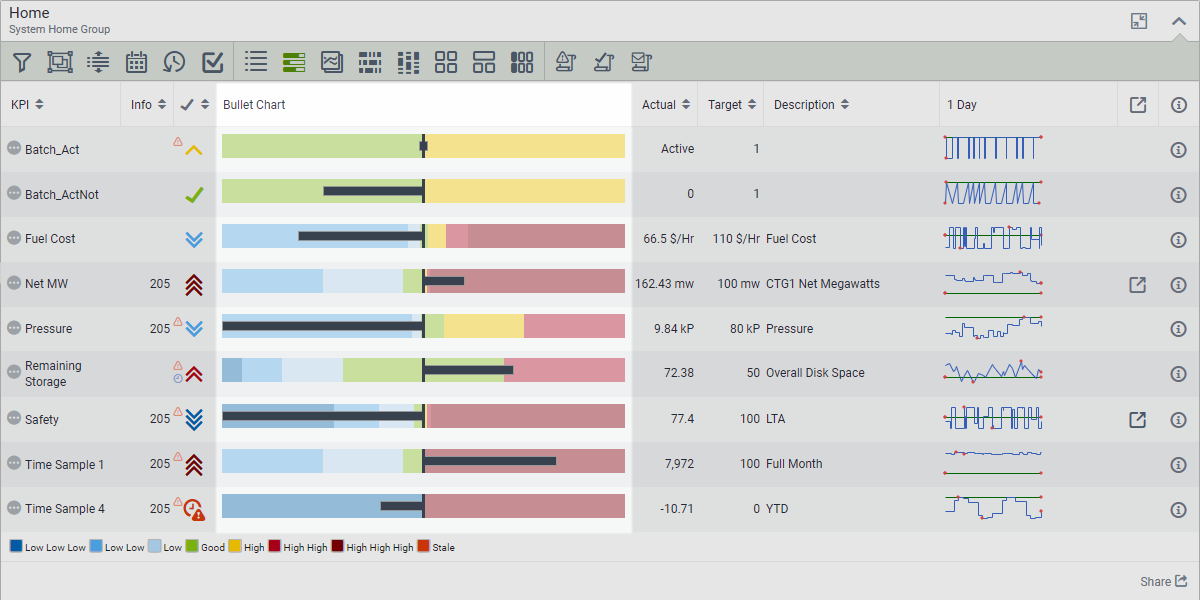
The Bullet Chart visualization aligns KPI values between two extremes:
- Leftmost Edge: Defined by the first significant low-side value (min, LLL, LL, L, Actual).
- Rightmost Edge: Defined by the last significant high-side value (max, HHH, HH, H, Actual).
The admin must define the values related to these limits through the Visual KPI Designer.
View as trend list
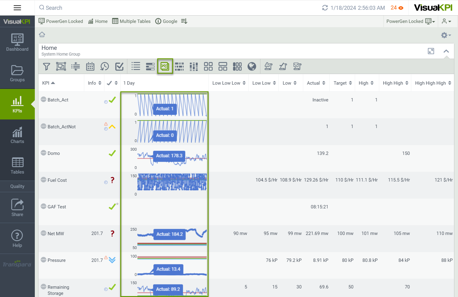
The Trend view () shows a real-time trend of KPIs, which is excellent for visualizing historical and time-stamped data by just moving your mouse over the trends. Trends can be configured in Visual KPI Designer or created on the fly by users.
You can visualize trends for individual KPIs or select up to 20 to view and compare as trends. With trends, you can compare multiple values or the same value at different times. As with all KPIs, the trend changes in real time as the data changes.
Trends are highly configurable. You can go back as far as data exists, define and customize time ranges, and more. You can even define custom Ad Hoc trends from your device and add them to your Dashboard. Use filters, grouping, and time ranges to elaborate all kinds of trends. Learn more about Trends and their different visualization types.
View as a status history chart
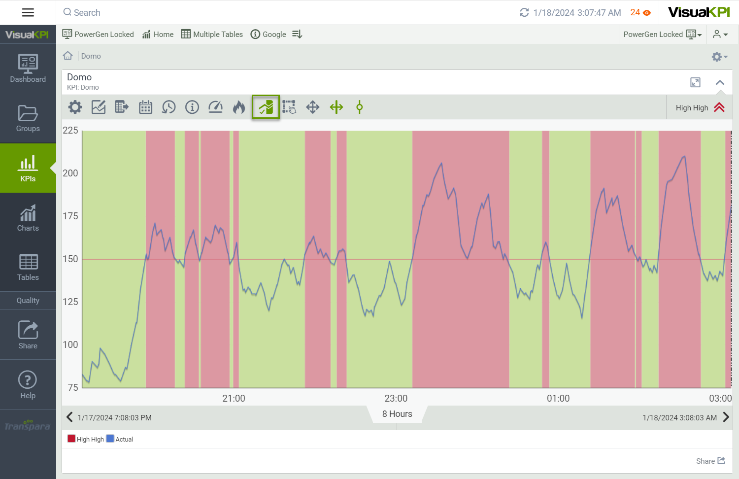
The KPI Status History view () shows you a summary and history of your best and worst KPIs at the group level. This view is similar to the KPI List view and the KPI Bullet Chart view, but the KPI Status History view shows status changes over time. Clicking on a KPI in this view opens the full KPI Status History Trend.
View status summary
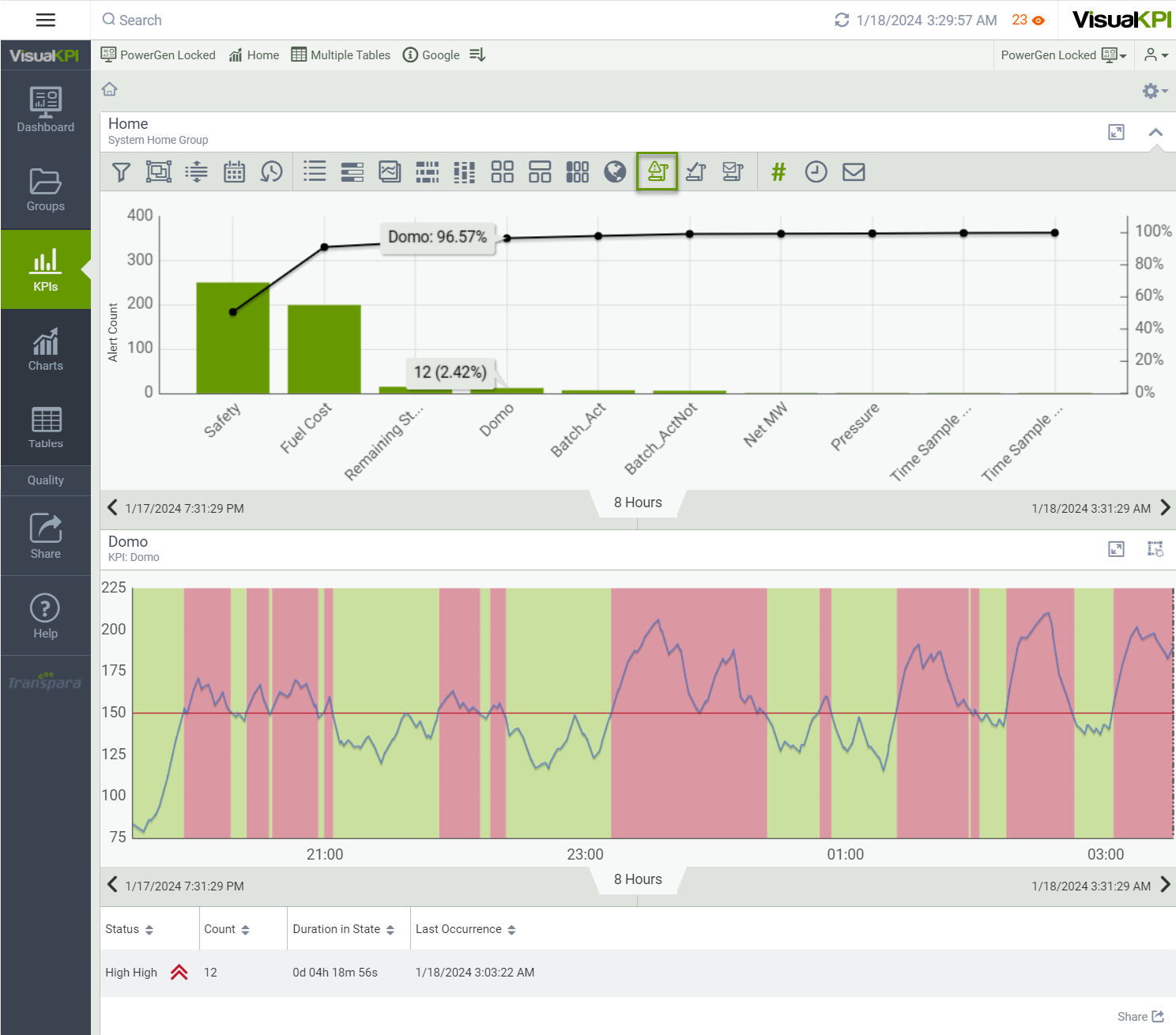
Visual KPI shows a summary and history of your best and worst KPIs at the group level. Status Summary (), Status History (), and Notification History () allow you to track over time the history of KPIs in alert and when alert notifications have been sent. You can see the status of the entire group as a Pareto chart and then get more details on individual KPIs. You can also adjust the time range to see a summary or history over a given reference and freely scroll backward and forward in time.
For any group of KPIs, retrieve a list of KPIs that displays relative performance over the period defined. The Pareto chart shows which KPIs are the worst performing as a percentage of the total. Move your mouse over a KPI in the chart to see a value.
View status history
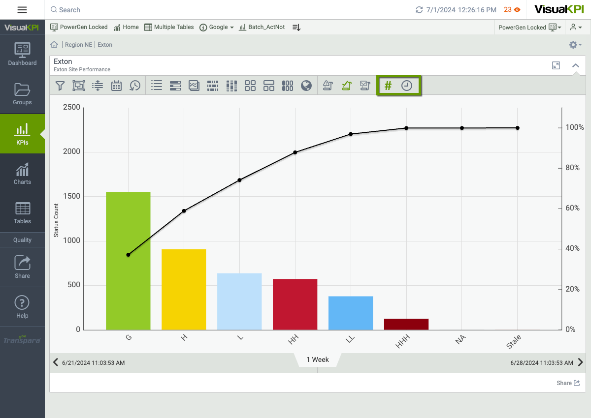
The KPI Status History view () shows you a summary and history of your best and worst KPIs at the group level. This view is similar to the KPI List view and the KPI Bullet Chart view, but the KPI Status History view shows status changes over time by projecting pre-configured background colors on your trends. Clicking on a KPI in this view opens the full KPI Status History Trend.
For Status Summary () and Status History () views, you can switch between alert count and time-in-state.
For the Status Summary, first select the Status Summary icon (). Then, select the Alert Count icon () to see how many times the KPIs have been in an alert state over the defined period or have reached a particular status over time. If you select the Time-in-State icon (), you'll see how much time a KPI spent in an alert state.
For the Status History, click on the Status History icon (), then select the Alert Count icon () to see how many times a KPI has reached a particular status over time. If you select the Time-in-State icon (), you'll see how much time a KPI spent in each status.
Click any KPI in the Pareto chart to see a trend over time and a list view below the trend.
View notification history
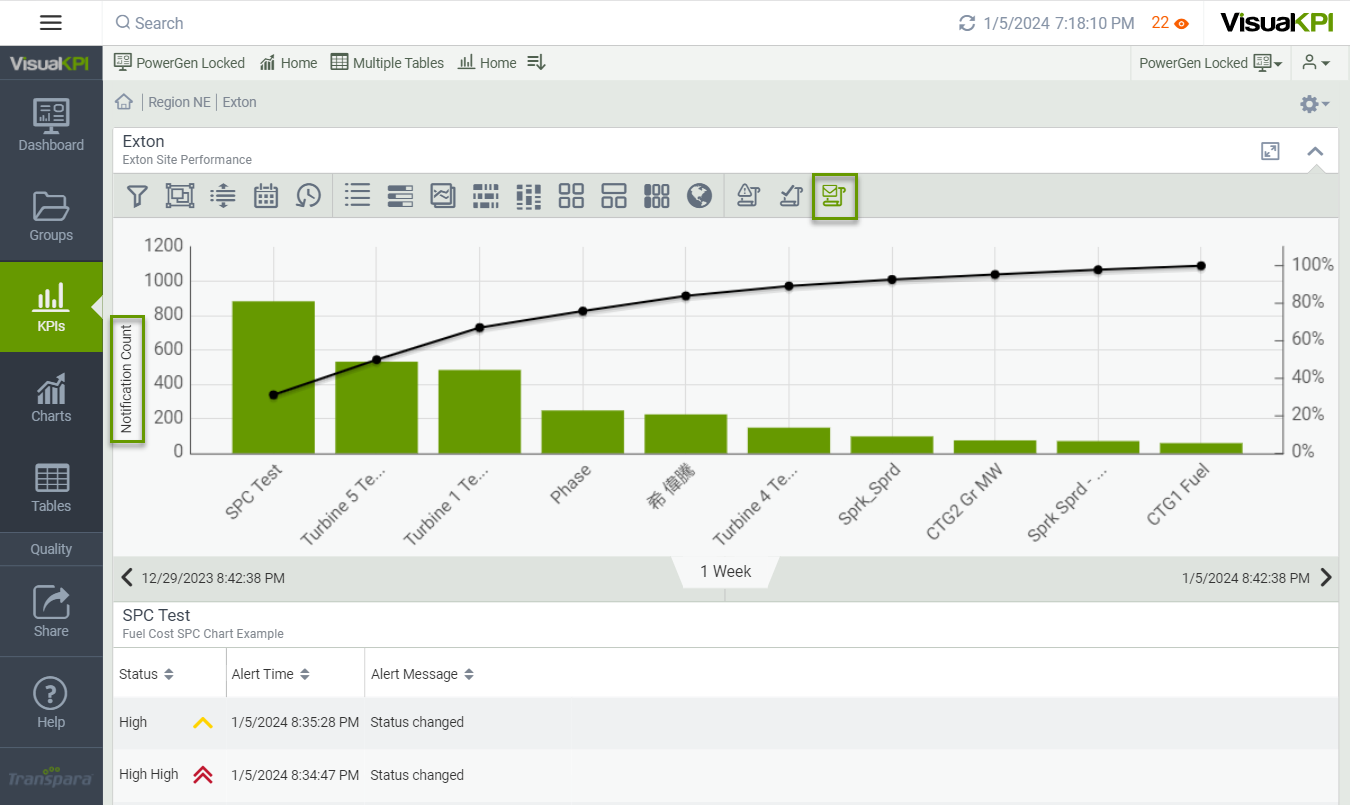
For any group, see how many times notifications have been sent for the KPIs in alert status by clicking the Notification History icon (). Note the log for status change below the Pareto chart, which also shows the performance of each KPI relative to the others in the group as a % of the total.
KPI details view
When accessing KPIs, you may want to know more about a particular one. Clicking the View Details icon (), you may find any of the following KPI details:
- Contacts
- Links
- KPI properties
- KPI stats
- Parameters
- Manual data entry (if enabled)
- Custom attributes
- Membership
KPI link view
You'll find links all over Visual KPI. Links can be configured by Visual KPI administrators or users. The link view isn't limited to internal links. You can add external links to software or other tools you often use. Some of the most common places you'll find the Visual KPI links view are:
- Visual KPI objects: Links from an object, such as a KPI, chart, or group. These are added as an attribute via Visual KPI Designer, and they're tied to the object and available to all profiles.
- Dashboard link widgets: using the Customize Dashboard widget, you can tie a link to a Dashboard. However, only profiles with access to these Dashboards will see them.
- Bookmark bar links: Links on the Bookmark bar are tied to a profile.
- Navigation bar links: These links, configured by your admin, are sitewide, and everyone with access to the site will see them.
- KPI detail pages: Links for the KPI detail view must be configured by your admin.
What's next?
Learn the best way to handle Charts on our page and get the best out of Visual KPI.