Hierarchy/Groups
In Visual KPI, Hierarchy/Groups define how you organize information. Groups work just like folders on your PC, and you can have as many groups as you want, with unlimited levels of groups containing multiple objects at any level of the Hierarchy.
The Group tab
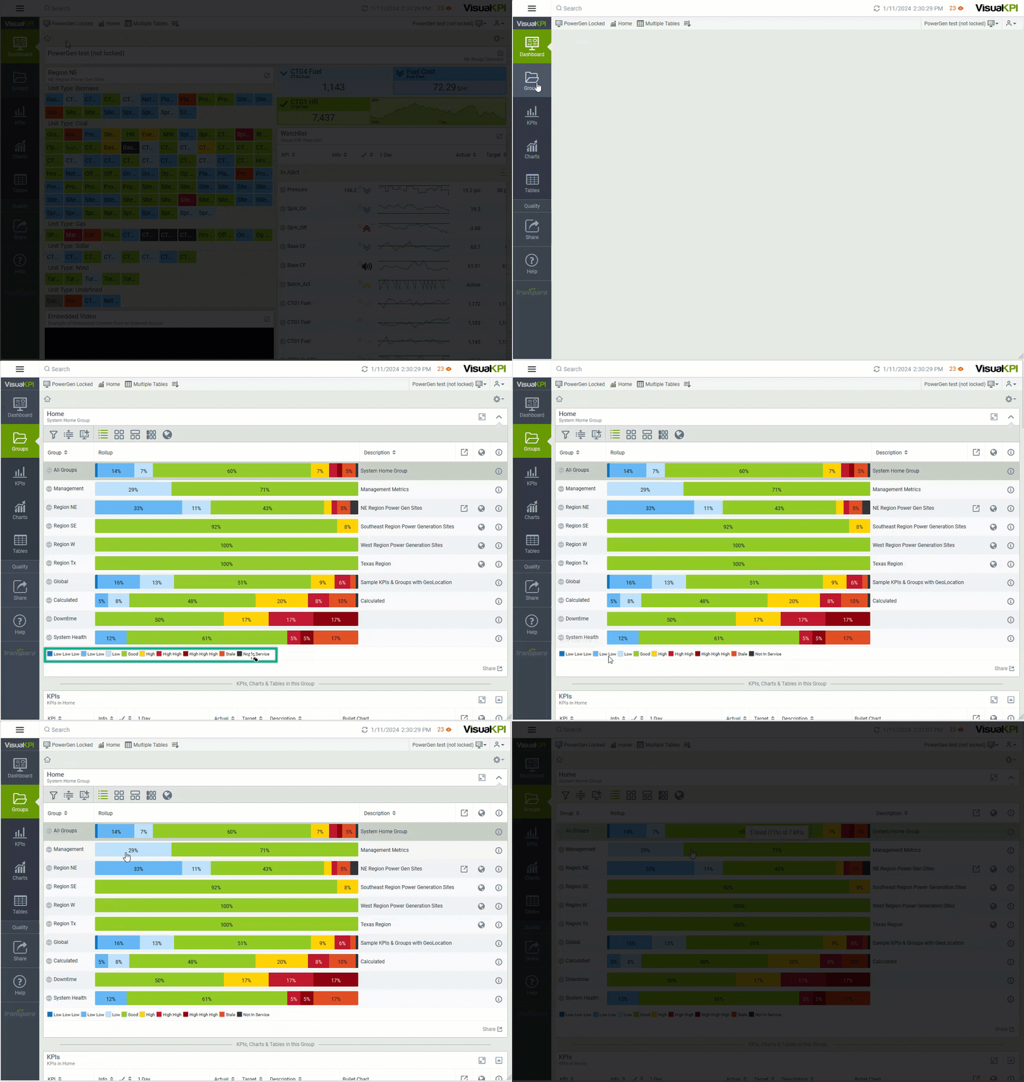
When you are on the Groups tab (), the roll-up visualization in the data area gives you an overview of what's happening in the various groups. A status legend below the data area shows you how to read the roll-up.

Hover your mouse over any status in the list to see details. As you move your mouse over the various colors representing status, you'll see a tooltip that tells you how many total KPIs are in the Group and how many are in that particular state. The colors and whether or not the condition is an alert status depends on your data, targets, and limits. These formulas are all set up by your admin within the Visual KPI Designer.
How Groups work
To understand how group navigation works, let's look at a concept you are familiar with: folders on your computer. Your computer may have folders with files and other folders inside. The same happens with Groups. A Group can contain other groups, KPIs, Charts, and Tables.
Consider the example shown in the GIF below. When Groups is accessed, we can see several other groups. When the Region NE group is selected, the user is redirected to the KPIs tab. It happens because no groups exist inside Region NE. However, Region NE contains KPIs, Charts, and Tables. That's why the user could access the three tabs, having access to all KPIs, Charts, and Tables that are part of Region NE.

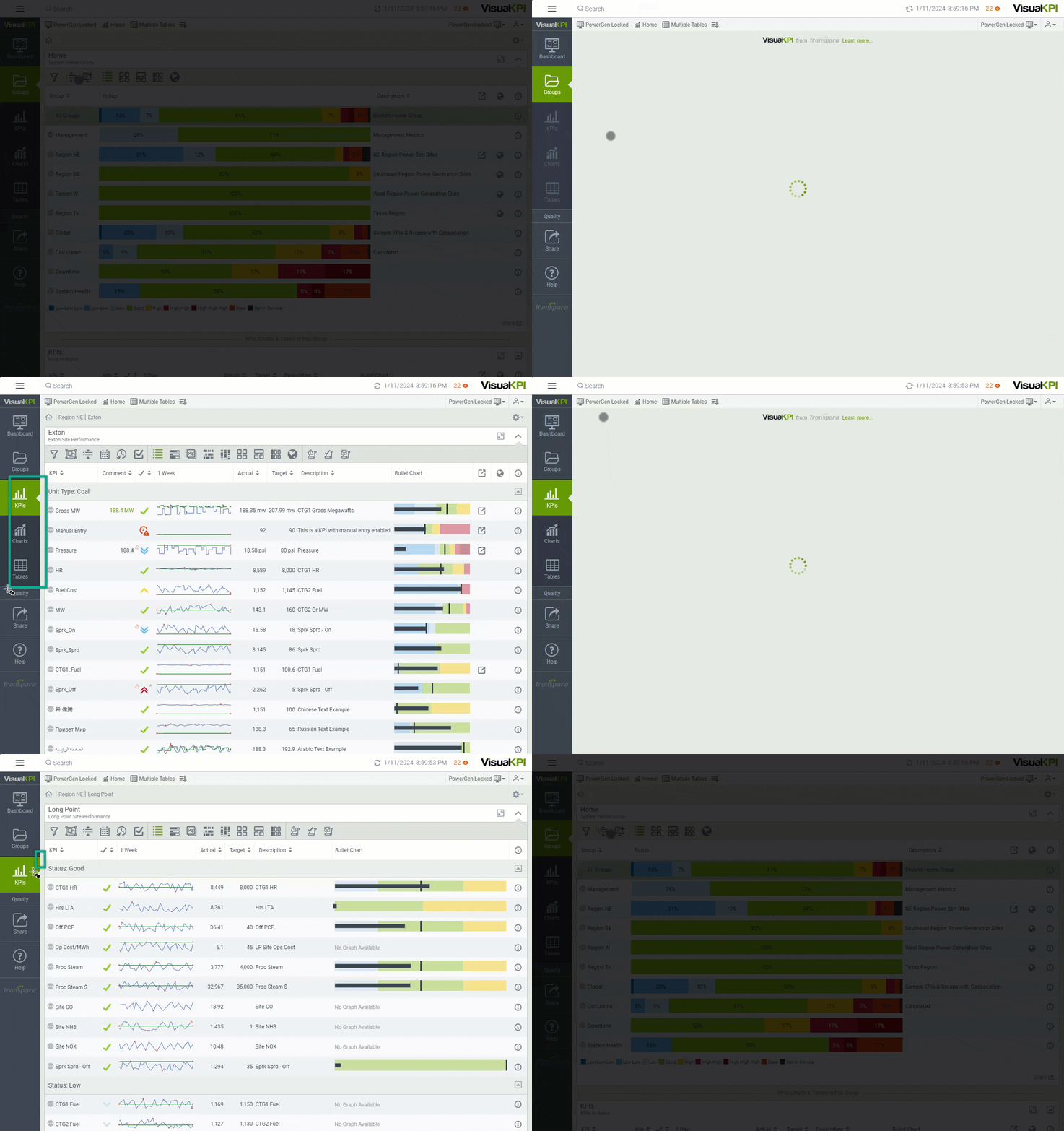
When a group doesn't have all three object types (KPIs, Charts and Tables), you will see only the tab of existing objects. In the example below, the user accesses the Extron group, and all object-type tabs are available. However, when the user accesses the Long Point group, only the KPIs tab is available, meaning that the Long Point group contains only KPI objects.

The object tab will be visible if objects exist in the current Group. When no objects exist in the current Group, but they exist in child groups, the tab will be grayed out. You can click it to see the objects. The object tab will disappear when no more objects are at the current level or below in child groups.
Breadcrumbs
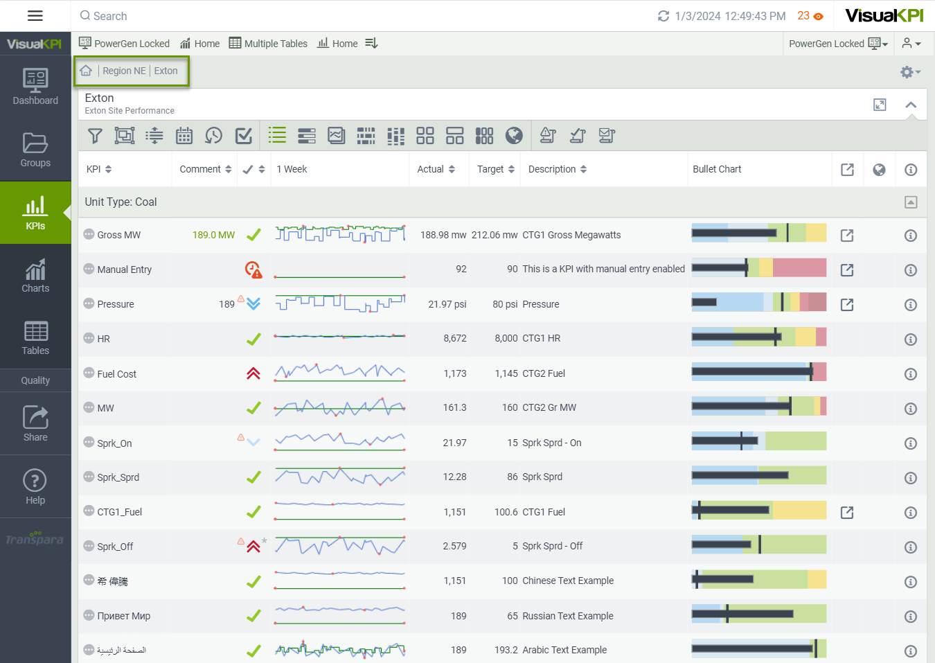
When starting from your Dashboard or clicking the Home icon (), you start at the top of the Hierarchy (top-level folder). If you have groups within groups, as you drill down into groups by clicking on the Group's name, Visual KPI displays breadcrumbs to show the path you have taken. It also allows you to jump back up to any level you want. The image below shows the breadcrumbs' location on the page.

If you want to return to the top-level Group, click on the Home icon () or the Visual KPI logo in the navigation menu. If you are in the KPI, Charts, or Tables tab, clicking on the Group tab will take you to the group level of the object you are viewing.
Group visualization
Some icons you see in Groups are universal. Others only appear if turned on and/or configured in the Visual KPI Designer. Others show up depending on what you are viewing. For example, if there is no Geo Map associated with a KPI. In that case, you won't see the Geo Map icon (). Some icons and functions you may see related to Groups are:
- Filter (): Filter by status or distance from where you are standing.
- Only show descendant/child groups ( / ): Show all child items of the Group you are currently viewing or collapse the list to go to the top level of the current list.
- Add Group to Dashboard (): Adds one or more selected groups to a dashboard.
- View as List (): This is the default view in the Group view, but you can see your data in other visualizations.
- View as KPI Map (): This option enables you to view a graphical heat map of all the KPIs in the level you are currently on. For more information, see Visualization.
- View as Group Map (): This view is similar to the View as KPI Map but is more advanced and gives each Group its status. For more information, see Visualization.
- View as Group Map Table (): This View shows groups as titles in a table. For more information, see Visualization.
- View as Geo Map (): This option combines the latitude and longitude of your assets and Google Maps to create an interactive visualization right inside the Visual KPI. For more information, see Visualization.
Add groups to a dashboard
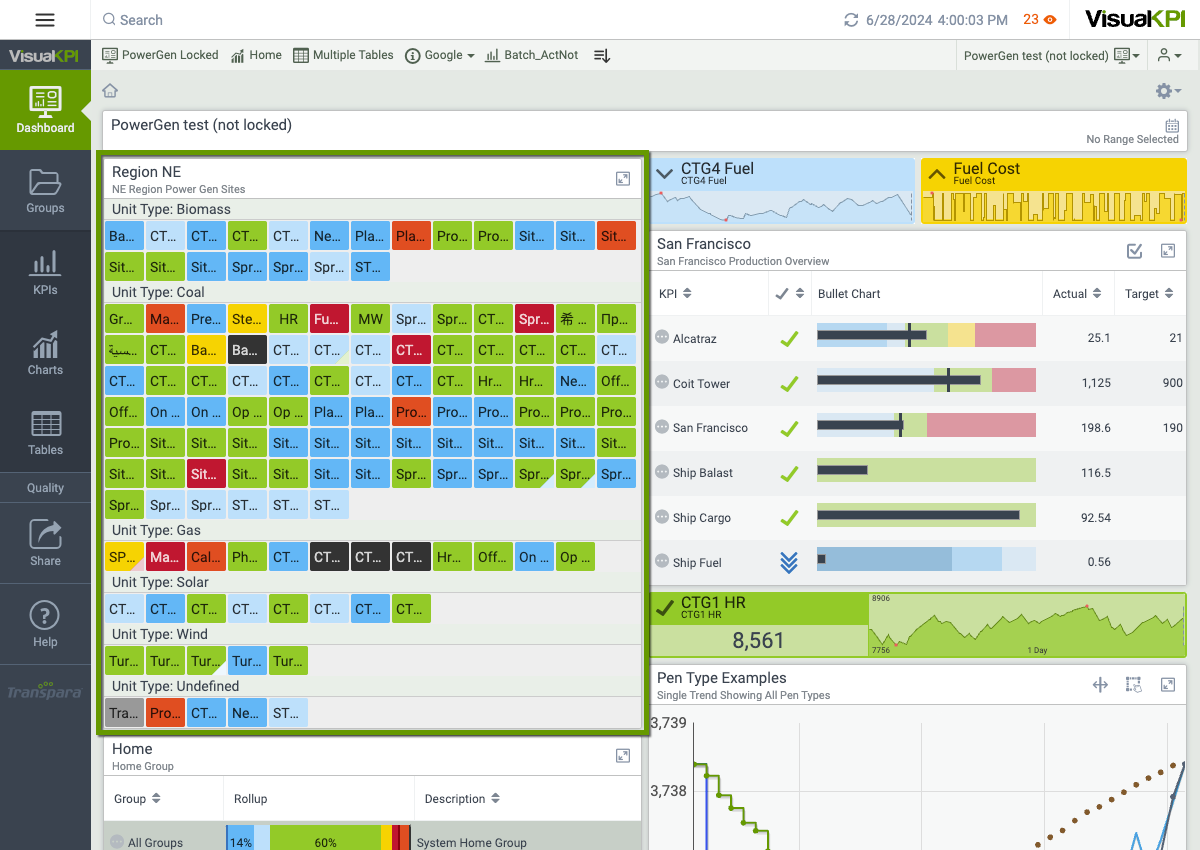
You can integrate Group visualizations in your Dashboard using Single Group Dashboard Widgets. These widgets feature a Roll-Up Bar, displaying KPIs from the main group and its subgroups. Each widget includes the group name, description, and group info (if configured).

To include a new Group visualization in your Dashboard, follow the steps below:
- Access the desired group.
- Click Options() on the top right.
- Select the Dashboard () to add the group. You can add it to the current Dashboard, a new one, or an existing one.
What's next?
Want to know more about Group visualization? Access the Visualization page to learn the basics of the different visualizations for your Groups and KPIs.