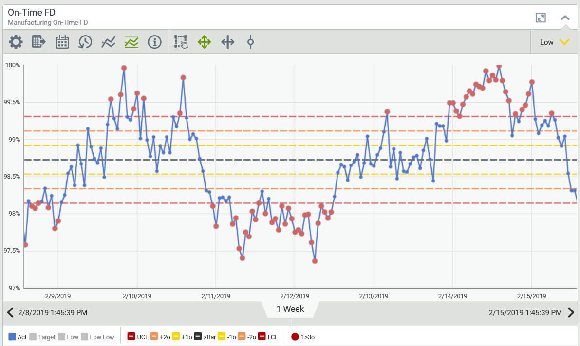
Trends
While a Trend is really a line chart, trends are one of Visual KPI's most powerful features because they are so highly configurable. KPIs can have trends automatically, users can create trends on the fly (Ad Hoc trends), or you can configure managed trends in Visual KPI Designer.
KPI trends can be configured around a single actual value plus targets and limits. A managed trend is a separate type of object that can contain up to 20 pens (from one or many data sources). Like any other object in Visual KPI, managed trends can have attributes, be group members, customized, and more.

Configure Managed Trends Attributes
After creating and configuring some basic attributes for a trend, such as the name, description, display order and group to which it belongs, you can begin configuring managed trends by defining data to be trended. Here, we show you the basic attributes you need to set to configure managed trends. To see all the possible attributes you can configure, see Menaged Trends Attributes & Keywords Reference Guide.
Visual KPI uses Pens to define each data set in a trend. You'll define attributes for each pen you create. You can have up to 20 pens in a trend, meaning you can trend 20 data sets in one chart.
Define Pen Value and Interface
Define a value, calculation, and/or interface for each pen. Pairing an interface with a value creates a dynamic value.
Name and Color Pens
The name and color of pens help you identify the data on display. Together, the name and color attributes build the legend below the trend.
Defining a color is optional. If you leave the colors blank, Visual KPI will generate a different color for each pen. You can also use a HEX color value in the Pen Color field.
You can define your own colors in Site Settings if you want to change the default colors you can choose from.
Configure Trend Type
When configuring managed trends, you can change the default Trend Type using the pulldown menu. The default type is Interpolated.
The Interpolated Trend draws a line from one value to the next. It is good for flowing data like temperature changes.
A Step Trend draws a line from one data set to the following. It is good for showing slower-moving data, such as average leave time per employee, measured in days and updated infrequently. Another excellent example for a Step trend would be showing how many employees clocked in today. It is a flat value, but if you trended that value for two years, you may want to see an Interpolated trend. Another good example of when to use a Step trend is when you want to display whether a machine is ON or OFF. The trend steps between on and off; there is no data in between.
The Symbol Trend Type drops a point where the data exists along the trend line.

Set Trend Scale
You can select a Single-Scale or Multi-Scale trend as you configure managed trends. A Single-Scale trend has a single Y axis and a single X axis, whereas a Multi-Scale trend can have as many Y axes as you have pens. The X axis is based on time and remains the same in both Single-Scale and Multi-Scale.
A Multi-Scale trend is useful for displaying very different values, such as the price of oil compared to oil production. It shows how values with different scales correlate.
Each Y axis is displayed in the legend beneath the trend, and the scale changes as you click an item in the legend.
Set Trend Y-Axis
Select how you want to display the range of data in the managed trend.
Auto-Scale, which is the default, displays the Y axis based on the data in the trend. The Y axis will change ranges to show the minimum and maximum ranges.
The Pen Min Y Axis and Max Y Axis attribute uses the individual settings you define for each pen.
Trend Min Y Axis and Max Y Axis sets the Y axis for the entire trend based on the Min and Max Y axes you set in Visual KPI Designer. It is a fixed Y axis (vertical range) for the whole trend.
So, if you use any attributes other than Auto-Scale, you also need to define the pen and trend min and max for the Y axis.
