Charts
Charts show data as it relates to its defined limits. Visual KPI uses many chart types to visualize data using status, colors, and limits. The chart view options are:
- XY plots ()
- Histogram ()
- Bar charts ()
- Pareto charts ()
- Pie charts ()
- Box plots ()
- Gantt charts ()
- Gauge charts ()
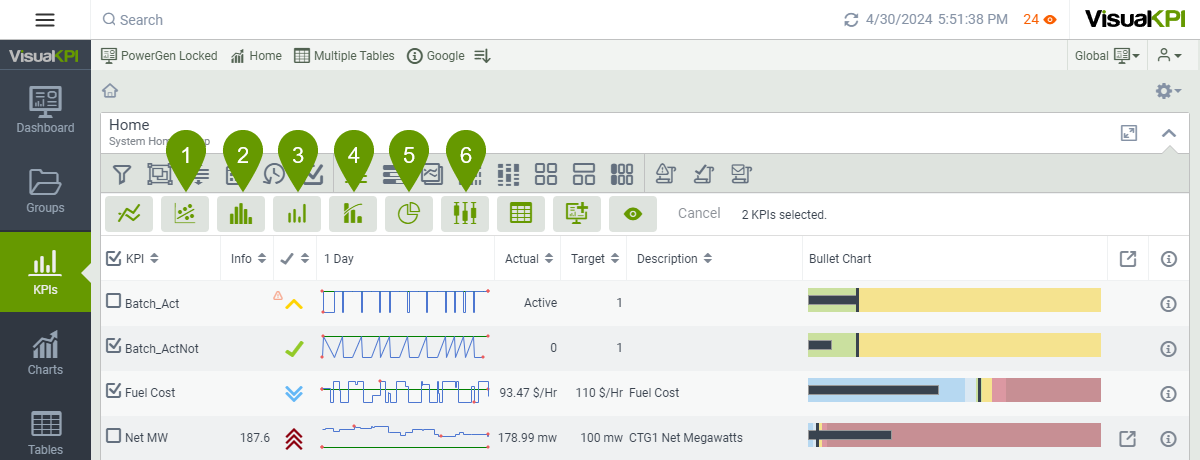
Not all charts are available everywhere. Depending on the object you select, different options can be available. Take the above image as an example. Only 6 of 8 chart visualizations are available when you access the KPIs menu and click Select KPIs ().
Note also that to use some chart options, you need to fulfill some requirements. For example, to make the XY plot visualization available, you need to select at least two KPIs.
XY plots
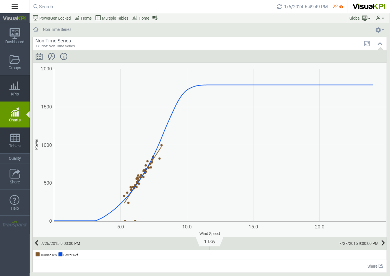
XY plots (), also known as Scatter charts, help you see how two sets of data are related. By looking at where the dots are placed, you can tell whether the two data sets have a relationship or pattern.
For example, a wind farm operator might use an XY plot to examine the relationship between wind speed (X-axis) and the amount of energy generated by the turbines (Y-axis). By plotting these data points, the chart can show how changes in wind speed affect energy output.
The XY plots can also compare multiple variables simultaneously, allowing for a comprehensive analysis of how different factors interact and influence KPIs. For example, the energy generated by all turbines in a wind farm can be plotted against the wind speed to compare efficiency.
Be sure to use similar data when plotting several KPIs on the Y-axis. Otherwise, the XY plot may present irrelevant results. For example, suppose your X-axis is the wind speed. In that case, adding a KPI related to the energy generated and another related to the energy cost at the Y-axis won't enable you to get any relevant pattern.
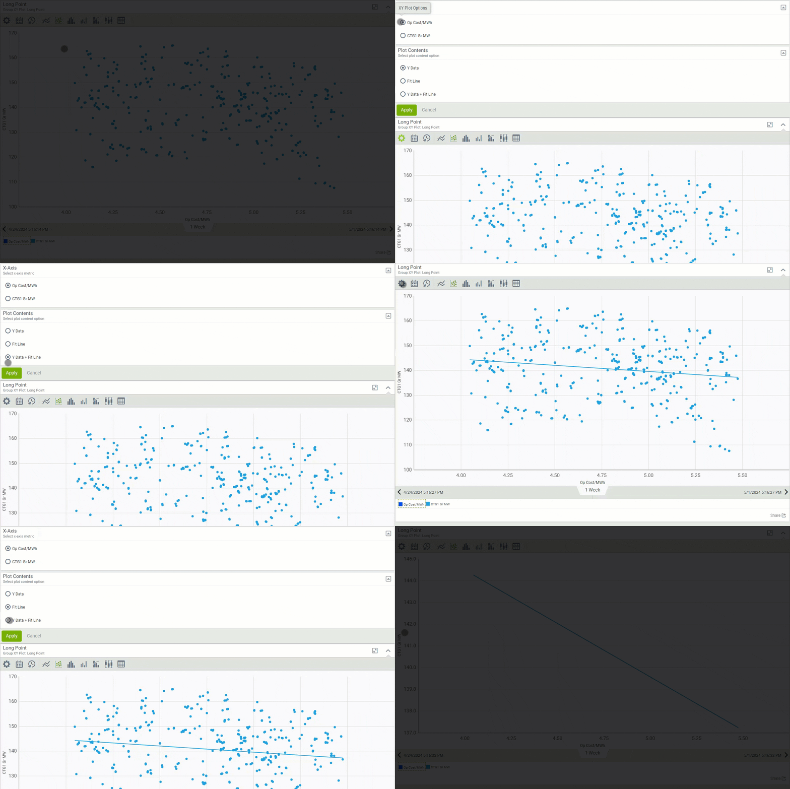
When you access an XY plot, you can add a fit line. This line shows the average value of the Y-axis data across the X-axis, helping you spot trends. Remember, this average isn't always about time because the X-axis isn't limited to time data.
To add the fit line, click the XY Plot Options icon () and choose either Fit Line or Y Data + Fit Line at the Plot Contents.
The XY plots in Visual KPI can be associated with time-series or non-time-series. In addition, they can be manually or query-based configured, depending on how your admin set it.
Histogram charts
Histogram charts in Visual KPI provide a way to visualize the frequency distribution of range values for your KPIs over time. A histogram is a type of bar chart that represents the distribution of numerical data by dividing it into intervals, often called bins, and counting the number of data points that fall into each bin. The height of each bar reflects the frequency of data points within that interval. The histograms help you identify concentrations and patterns that inform decision-making.
To define the number of bins for each KPI Histogram chart, Visual KPI uses the following formula based on the number of data points (n):
Number of Bins = 3 + log2(n) * log(n)
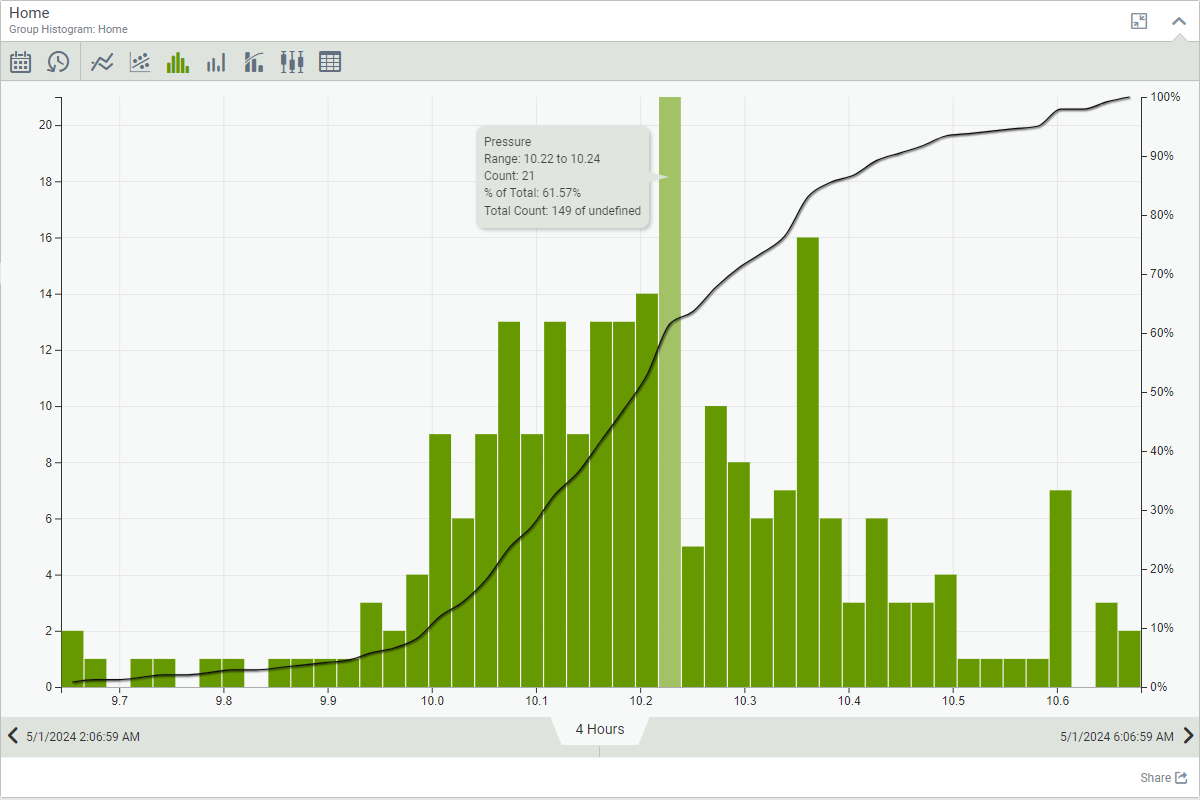
The Visual KPI Histogram chart contains bars and a line graph, where bars are related to the count of data points within a range, and the line represents the cumulative total. The left Y-axis represents the total count of data points, while the right Y-axis presents the percentage of data points. The X-axis will always show the value range of the KPI.
To better understand how to analyze the histogram information, let's use the example of the image below from pressure measurements. When you select a bar from the Histogram charts, information for that value range will appear. For the one selected and displayed in the image below, you can see that:
- The considered pressure interval ranges from 10.22 to 10.24
- From the total data points available for the 4-hour time range, 21 are within the pressure interval.
- 61.57% of the data points have values in or below the pressure range of the selected bar. The black line displays the percentage information.
You can use Histogram charts to visualize data from multiple KPIs simultaneously, comparing their distribution. However, the Histogram chart may present irrelevant or hard-to-read information if you use KPIs of different magnitudes, such as pressure and temperature.
Histogram charts are useful for KPIs that aren't regularly sampled. They help spot problems that might be missed when analyzing trends with varying sample sizes. A Histogram can show if the data that shows your KPI in a bad state has a relevant amount of samples or if it may be associated with a possible measurement error.
Bar charts
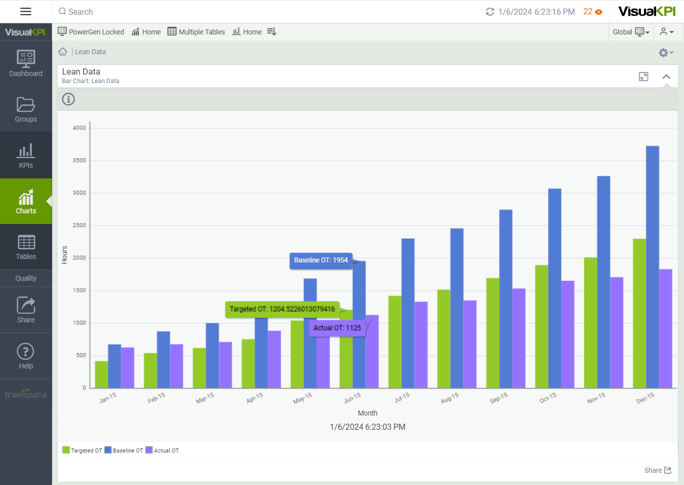
Bar charts () can be used to show comparisons of data against targets and limits in either a vertical or horizontal chart. You can compare only one specific set of data, where each bar represents the data, or you can cluster data sets so that each specific set has its bar. Still, the related sets are clustered and compared against other clustered data.
Depending on the configuration by your admin, Bar charts can be:
- Time-series or non-time-series data.
- Manually or query-based configured.
- Stacked and clustered.
- Horizontal or vertical.
- Custom colored.
- Color changing above and below the target.
Pareto charts
Pareto charts () can help you quickly see which of your assets are most critical and know where you need to focus. Thus, you can use them to monitor quality control, identifying where most problems come from.
A Pareto chart contains bars and a line graph:
- Bars graph: Displays variables in descending order of magnitude, with the most critical factor appearing first. Each bar represents a unique element or issue.
- Line graph: Shows the cumulative percentage of the total impact each element contributes. This line helps visualize how adding one factor to another cumulatively accounts for most of the effect.
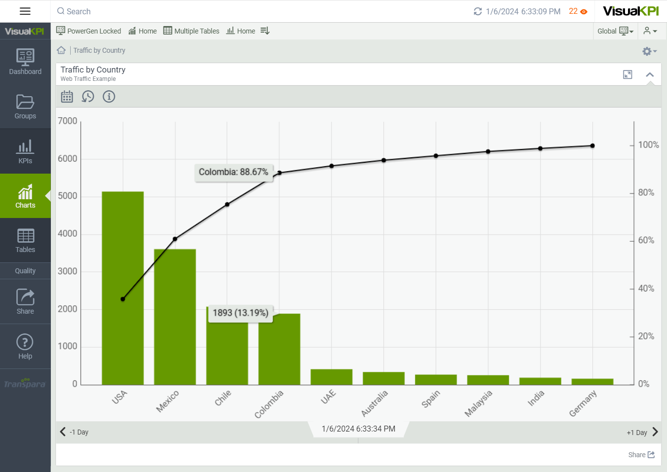
In Visual KPI, you can show relative data using stacked Pareto charts. Each bar can show multiple values, each displaying a different color, and as you move your cursor over each bar, you'll see the actual values as tooltips.
Pie chats
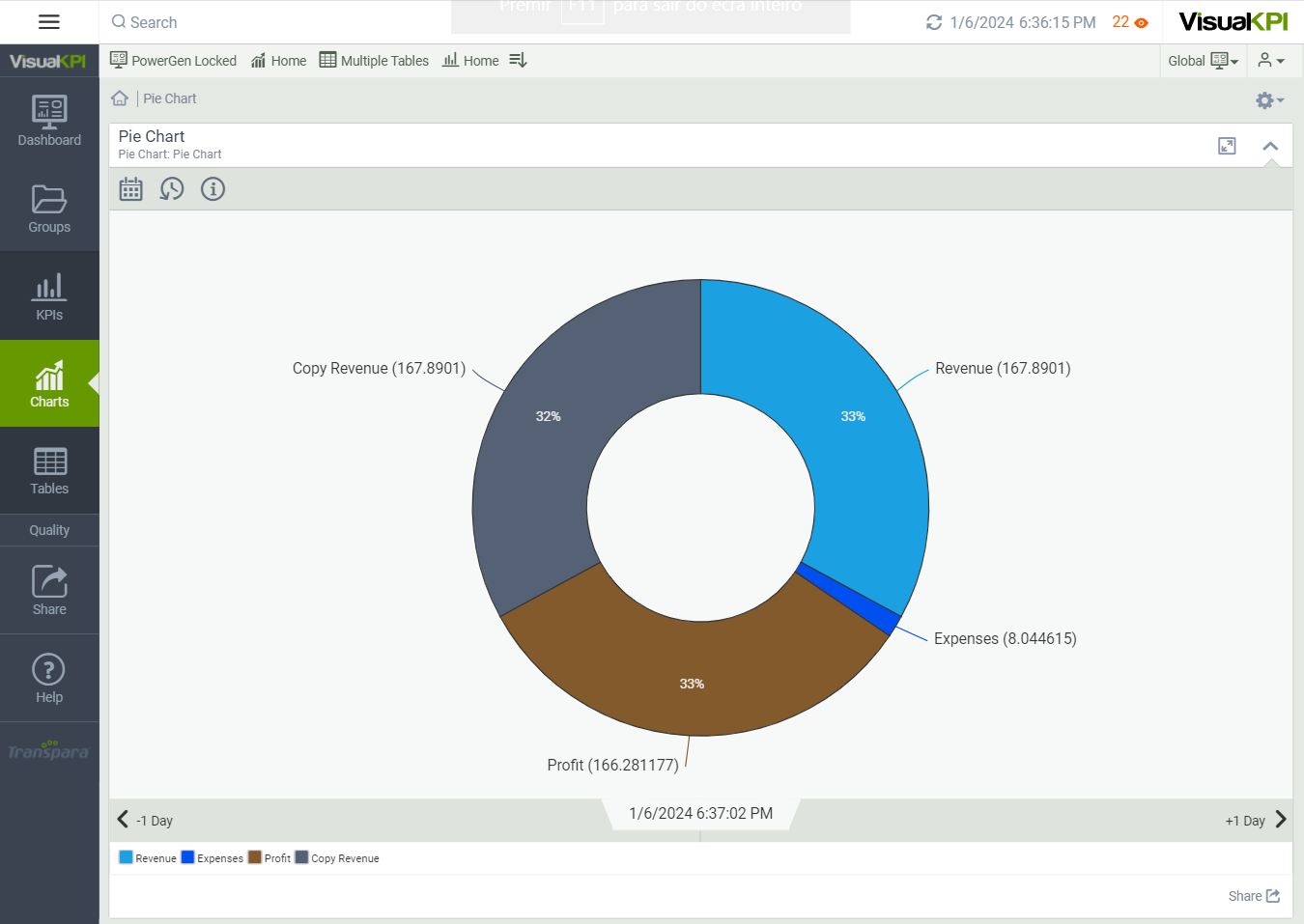
Pie charts () display a simple graphic that shows the relative proportions of your compared assets. However, Pie charts have some disadvantages for Visual KPI, such as their size for screen presentation and the limited ability to compare peer data.
Depending on how your admin configures them, Pie charts can be:
- Manually and query-based configured.
- Mouse over dynamic.
Box plots
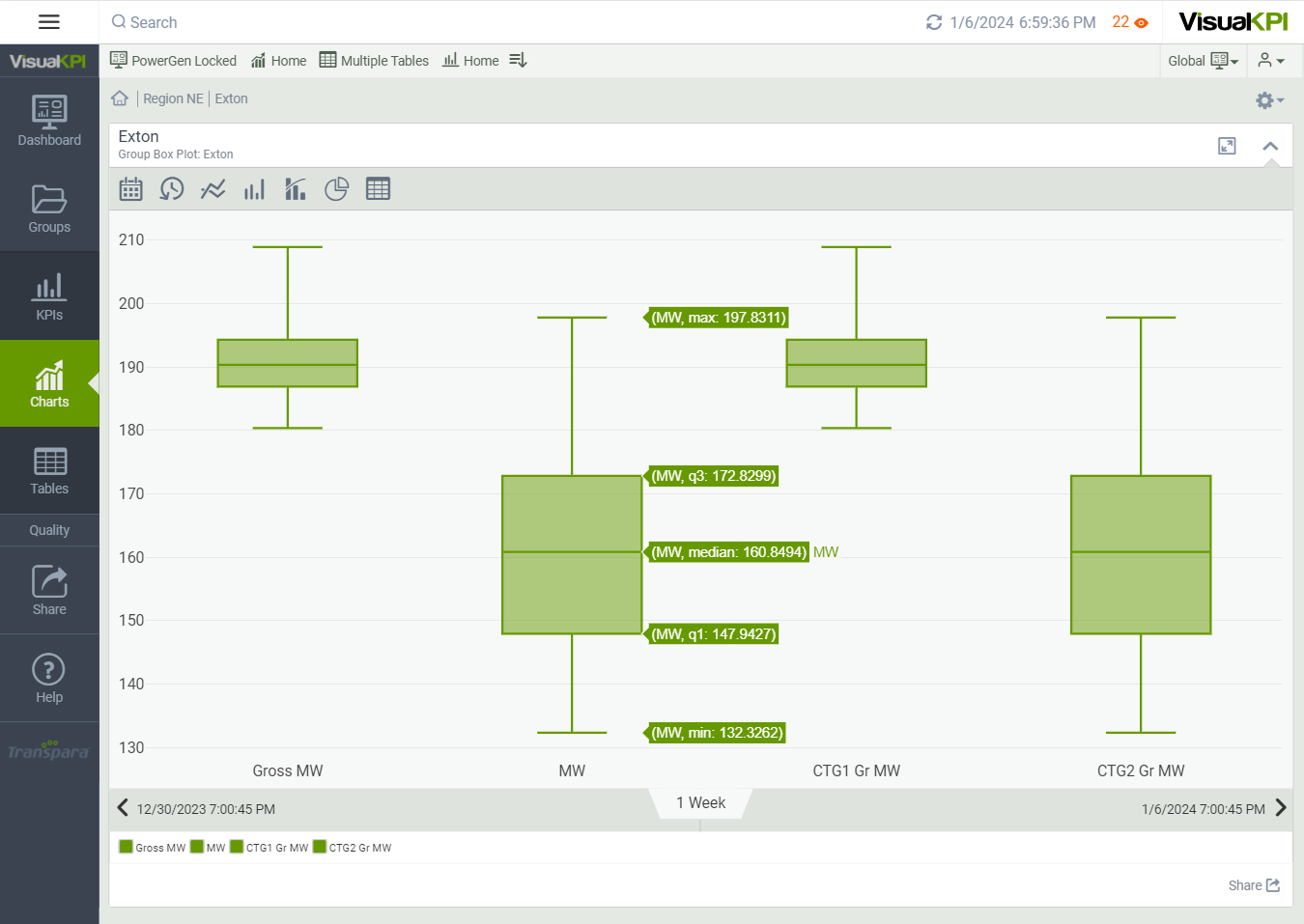
Box plots () display variation in samples without making assumptions about the underlying statistical distribution. In Visual KPI, Box plots can be based on time-series data or non-time-series data.
Box plots display a dataset through quartiles:
- Minimum: the lowest data point, excluding any outliers.
- Median: the middle value of the dataset.
- Maximum: the largest data point, excluding any outliers.
- First quartile (q1): the median of the lower half of the dataset.
- Third quartile (q3): the median of the upper half of the dataset.
End users in Visual KPI sites can create box plots, or admins can create Box plots in Visual KPI Designer. In addition, Box plots can be created manually, or they can be query-based.
Gantt charts
Gantt charts () are great for showing time-sequenced events. They can show you all of the elements of a project along a timeline, including when each component is scheduled to be completed, any dependencies, and the status of each. Task or project elements are listed along the vertical axis of the Gantt Chart, and the horizontal axis displays time intervals.
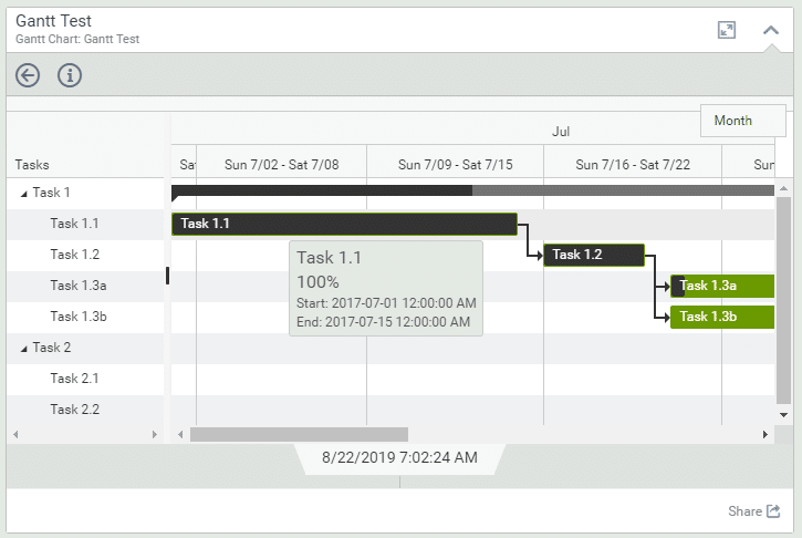
Gantt charts are only query-based in Visual KPI. Your admin must create them.
Gauge charts
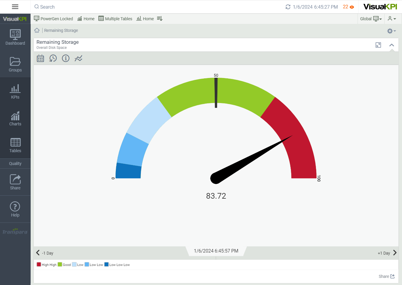
Gauge charts (), also known as Dial or Speedometer, are a meter-type visualization that shows the real-time status of a KPI, indicated by a gauge and needle, within a range that includes targets and actual values. These charts include minimum and maximum ranges and an indicator for an ideal target. They also can be used to show actual performance versus targets or progress toward a target for anything from temperature, weight, and speed to percentages of sales or work completed, performance, and more.
Gauge charts are ideal for showing the following:
- Actual status related to targets.
- Progress toward a goal.
- Percentage measurement.
If configured by your admin, you can visualize any trend as a Gauge chart. Simply click the gauge icon on any KPI trend view.
What's next?
Explore the Trends page to discover how to create dynamic trends that help you effectively monitor your KPIs.