Dashboards
Dashboards offer a personalized overview of your core information. Customize multiple dashboards to monitor the processes you manage efficiently. You can customize your dashboards with several Visual KPI objects like KPIs, charts, tables, groups, trends, and external links. In addition, it's possible to easily arrange, resize, and incorporate custom images, statistics, and dynamic text blocks.
Selecting a Dashboard
To change between different dashboards, use the Dashboard () pull-down menu to see the existing dashboards associated with the profile you are currently using. You can create new dashboards in that menu using the New Dashboard option.
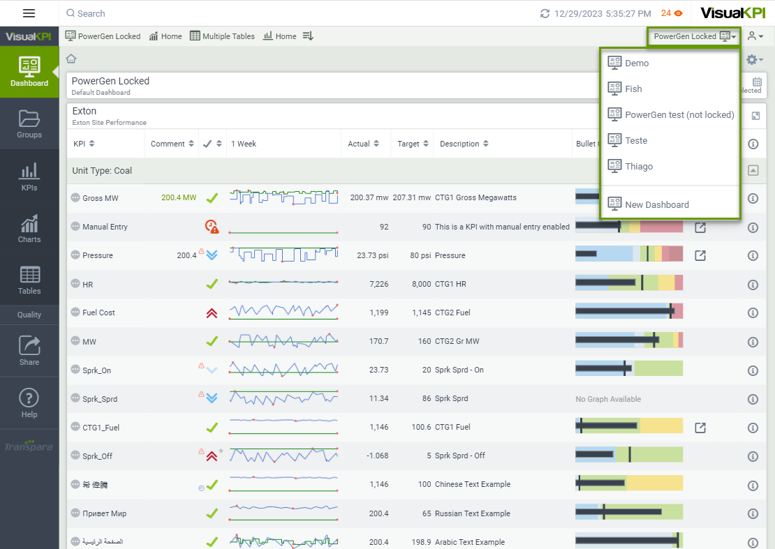
You can have as many dashboards as you want, linked to one or more profiles. When you change your profile, the dashboard list updates, presenting the dashboards linked with the current Dashboard.
How to create a Dashboard
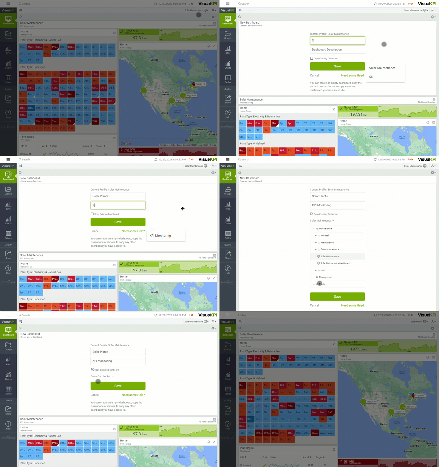
You can create a new dashboard from scratch or copy an existing one. For instance, copying an existing dashboard can be helpful when you want to edit a locked dashboard or compile dashboards from different profiles in your profile. To create a new dashboard, follow the steps below:
- Open the Dashboard() pull-down menu.
- Select New Dashboard.
- Type a dashboard name and description.
- If you want to copy an existing dashboard, check the Copy Existing Dashboard option. Use the pull-down menu to choose the existing dashboard you wish to copy.
- Click Save.
You'll be automatically redirected to the new dashboard page.
Options menu
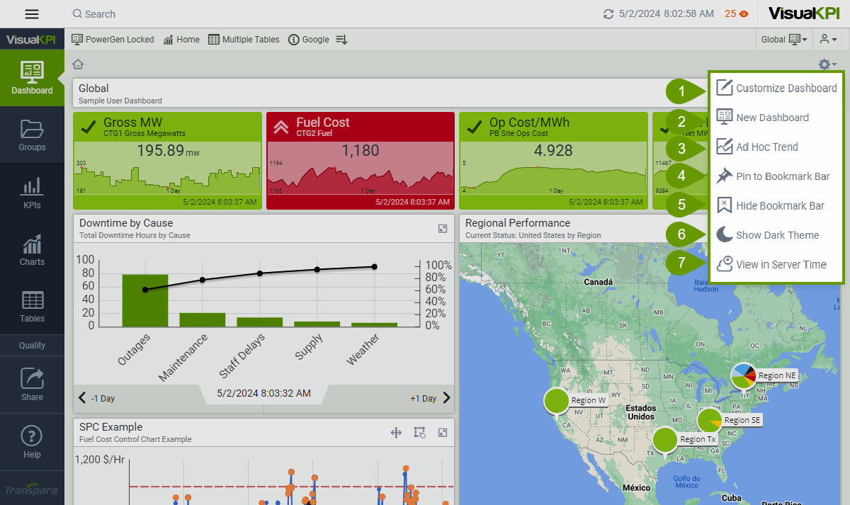
In the Dashboard, the Options menu () offers different ways to interact with Visual KPI depending on what you are viewing, the configuration of your Dashboard, and whether it's locked or unlocked by the administrator. Here are the possible available options on the Dashboard Tab:
-
Customize Dashboard (): Allows you to customize your Dashboard or create a new one, assuming you aren't using a locked profile.
-
New Dashboard (): It's an alternative way to create a new dashboard.
-
Ad Hoc Trend (): Create an Ad Hoc Trend, a custom type of trend that you can build inside your Visual KPI site and add to your Dashboard.
-
Pin to Bookmark Bar (): You can pin almost anything in Visual KPI to the bookmark bar, such as a KPI, chart, table, or external links. When you choose this option, Visual KPI creates a shortcut to the page you're accessing at that moment. Use the pins at the top to navigate to important pages quickly.
-
Hide Bookmark Bar (): Use this option to hide the Bookmark Bar.
-
Show Dark/Light Theme ( or ): Switch between Dark and Light Themes.
-
View in Server/Client Time (): Change the displayed times and dates between Server and Client Time.
Customize a Dashboard
In addition to creating Dashboards based on existing models, you can arrange your Dashboard to suit your needs by:
- Resizing and moving KPIs.
- Selecting different KPIs' visualization.
- Adding new objects.
- Defining custom time ranges.
The Customize Dashboard () option is only available in the Dashboards tab.
After customizing the dashboard, click Save at the bottom of the panel or the green checkmark () at the top to save your customizations. Otherwise, you'll lose your changes.
Resize and move objects
The option to resize and move KPIs and other objects enables you to place the KPIs you use often or need to see immediately at the top of the screen and make KPIs larger or smaller in size.
To resize or move KPIs in your Dashboard, follow the steps described below:
- Click Options() on the top right.
- Select Customize Dashboard ().
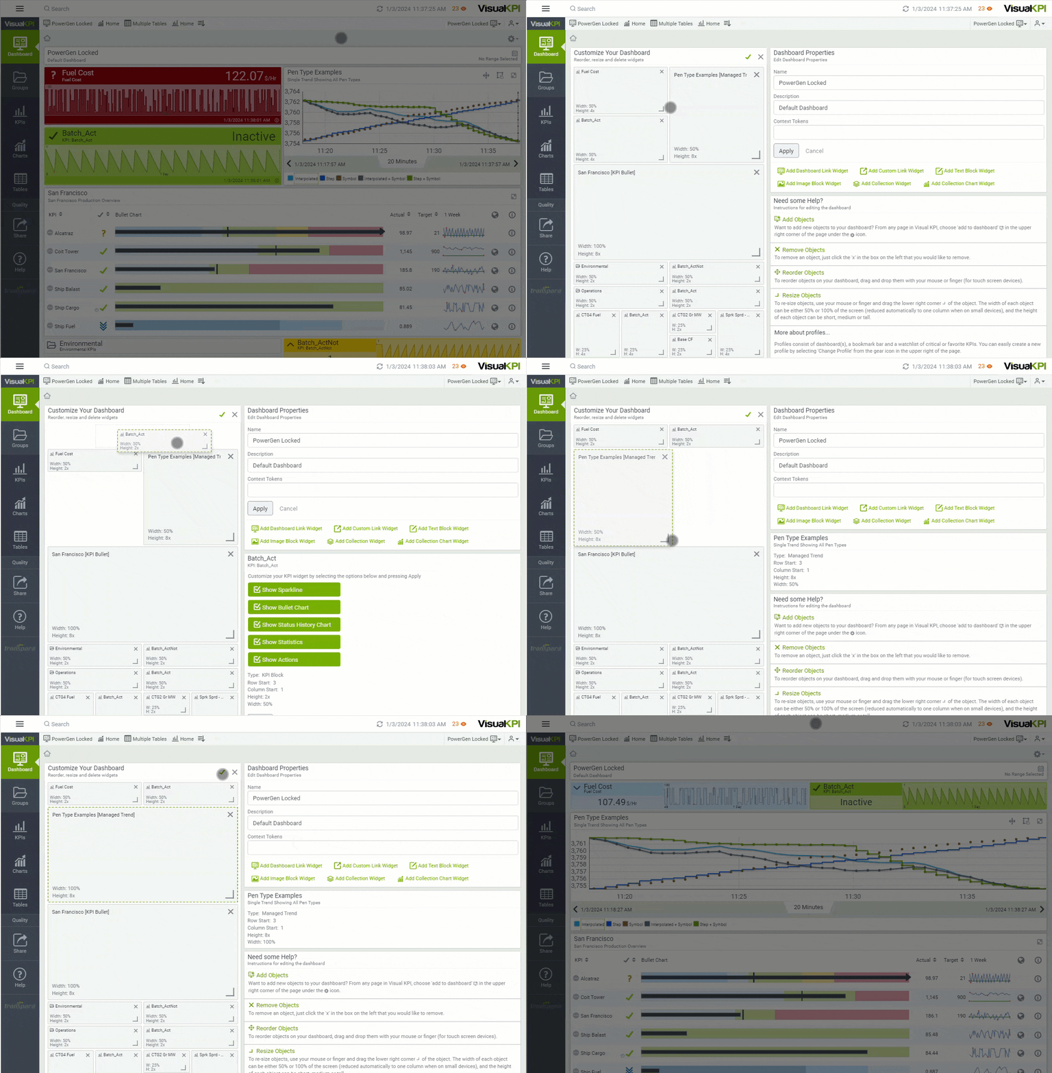
- On the Customize Your Dashboard screen, you find blocks representing the existing KPIs and other objects from the current Dashboard.
- Move: To move an object, drag and drop it into place. As you move the object around the Dashboard, other objects will move over to make room.
- Resize: To resize an object, you have some options:
- Drag right or left to make the object wider or narrower.
- Drag up or down to make the object taller or shorter.
- Drag the lower-right corner to change both dimensions at the same time.
- After customizing the objects as you wish, click Save at the bottom of the screen or click on the green checkmark at the top ().
You can see a configuration example in the GIF below.
KPIs and other objects vary in size based on their type.
- Geo Maps and KPI lists must be at least 1/2 of the width of your Dashboard (up to full width).
- Charts, trends, texts, or image widgets can be as small as 1/4 of the Dashboard width.
- KPI dashboard widgets can range from 1/4 to 1/2 of the width. The same applies to height.
- Some Dashboard objects can expand to 8 times (8x) the original height.
Select an object visualization
Some Visual KPI objects have multiple possible visualizations and information that can be displayed directly on the Dashboard. You can select the visualization and information you want to see on your Dashboard through the Dashboard customization page. To change the visualization option, follow the steps below:
- Click Options() on the top right.
- Select Customize Dashboard ().
- Select the object block for which you want to change the visualization in the Customize Your Dashboard page. A green dashed border appears around the selected object, and a new board listing all available visualization options will appear.
- Check the visualization option you want to see in the Dashboard for the selected object. Depending on the object type, different options will be available. The complete list is presented below:
- Sparkline
- Bullet Chart
- Status History Chart
- Statistics
- Actions
- Click Apply.
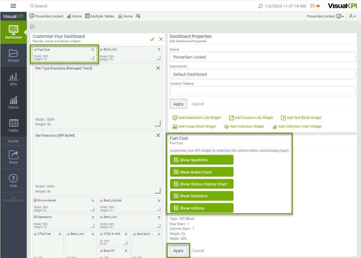
If you change a visualization or information selection and don't click Apply, a red border will appear around the object to show that your changes were not saved.
Add new objects to your Dashboard
You can add any object to your Dashboard or even use an object, such as a KPI, to create a new dashboard with just that object. To add a new object to an existing or new Dashboard, follow these steps:
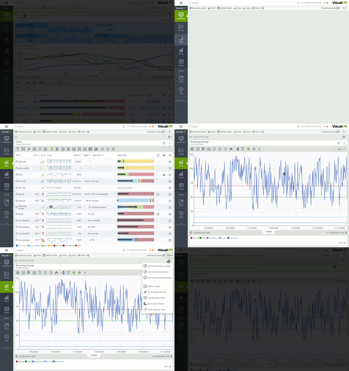
- Access the KPI, object, or any visualization you want to add to the Dashboard.
- Click Options() on the top right.
- Select one of the three options available:
- Add to Dashboard (): The current dashboard name will be in the Dashboard place. This option adds the current view directly to the Dashboard you're currently using.
- Add to New Dashboard (): This enables you to use the current visualization in a new dashboard. If you choose this option, you'll need to provide the new dashboard name and description, which will contain only the selected object. However, you can add new objects in the future.
- Add to Existing Dashboard (): Use this option to add the current visualization to another dashboard other than the one you are currently using.
Consider creating a new dashboard when making a data story or analyzing a project. With this approach, you can easily share the insights. As you continue the analyses, you can add new objects to the dashboard, enabling you to build a complete snapshot of the analysis task.
The current object will be available on the selected Dashboard. You can use the resize and move objects to position them in the desired place.
Customize the Time Range
Each KPI has a different standard Time Range for presenting data. However, to perform some analysis, it's important to have all objects using the same Time Range to examine cause and effect, for example.
To define a standard Time Range for all objects in your Dashboard, follow the steps below:
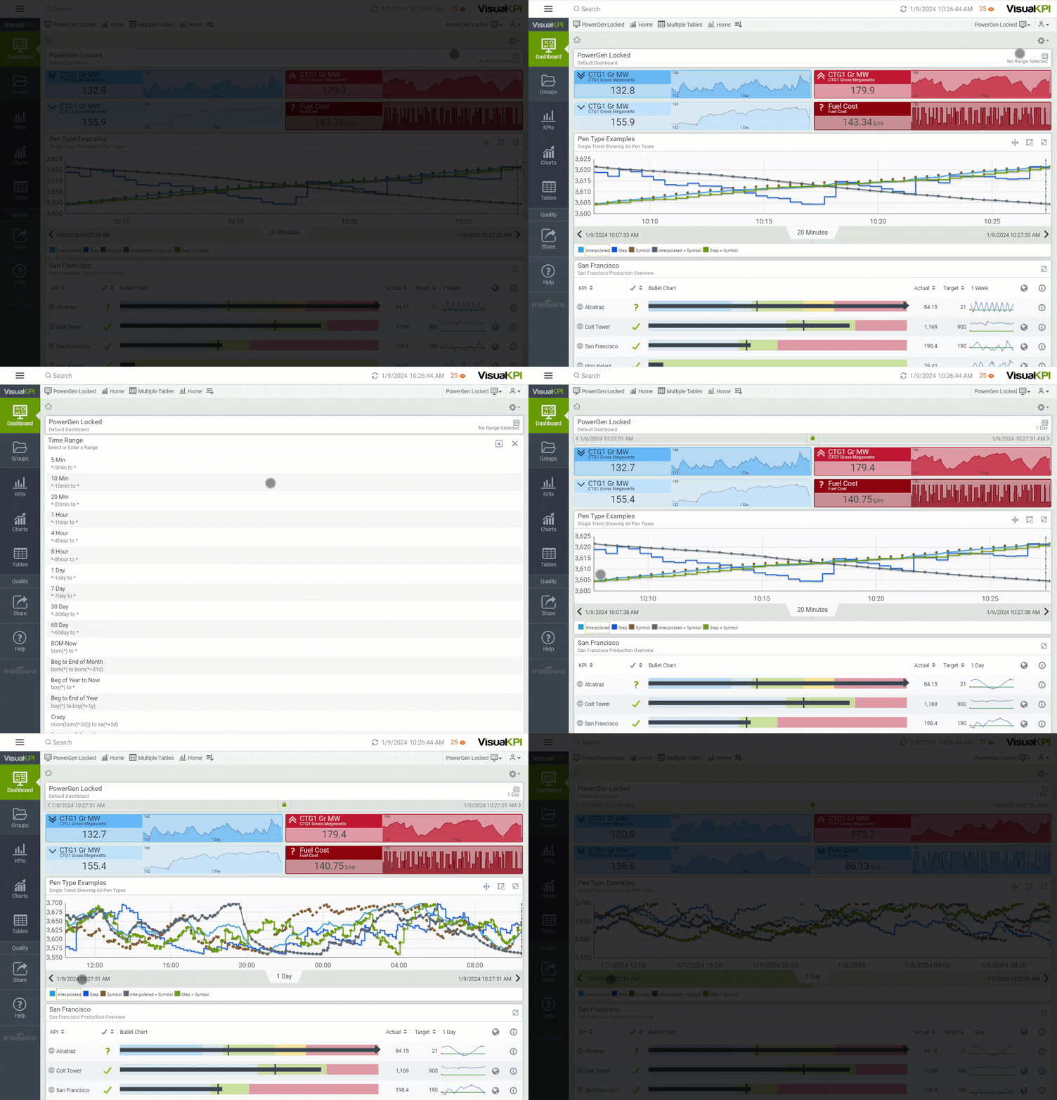
- Click on the Time Range Picker ().
- Select a default or custom Time Range.
All data related to time will be displayed on your Dashboard based on the selected range. Use the time range paddles to advance or regress the time range. For example, if you selected a 24-hour time range, the advance paddle will show KPI data for the following 24-hour period.
Some objects, such as Geo Maps, don't have an associated Time Range. They only present the current value. Therefore, no changes occur in those objects when you change the Time Range.
What's next?
Learn how Group objects work in Visual KPI and how to navigate around the available features.