Visualization
Visual KPI provides different options to visualize data, making it easier to communicate information and suit different learning styles, ensuring everyone in a company can easily understand trends and patterns. Additionally, having various visualization options lets users personalize their views to focus on the insights that matter most to their roles.
Group visualizations
Groups are how your information is organized, a key form of navigation. Some of the icons you see in Groups are universal. Others only show up if they have been turned on and/or configured in the Visual KPI Designer. And still, others show up depending on what you are viewing.
Top Bar
In the top bar, you find different visualization options for your groups and KPIs. Some icons and functions you may see related to Groups are:
- Filter ()
- Only show descendant/child groups ( / )
- Add Group to Dashboard ()
- View as List ()
- View as KPI Map ()
- View as Group Map ()
- View as Group Map Table ()
- View as Geo Map ()

Group Roll-Ups/List View
The Group Roll-Up is the list view, which is the default view in Groups. You can always come back to this view by clicking the List View icon ().
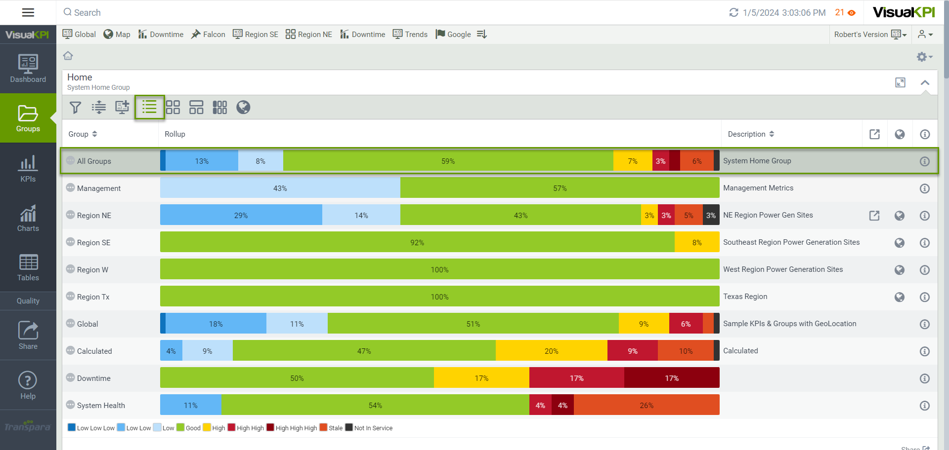
Group Roll-ups are bar charts that summarize how all your KPIs in a defined set (Group) are performing at a glance. The colors on Group Roll-ups indicate status and are relative to the other colors. Each bar shows the group's performance in percentages and rolls them up to show how that group is performing.
The top bar in Group Roll-Ups (parent group) represents the overall status of the group. It includes the parent group and all child groups. That means that no matter how many levels of groups you have, the parent group will always roll up the overall status of all the KPIs in that group and every group that belongs to that group.
Filters
Use the Filters () option to customize Groups, KPIs, Charts, or Tables you are currently viewing based on selected parameters. You can select filters to show only those objects with a specified status. The filtering options may vary in Groups, KPIs, Charts, and Tables. It also depends on how the Visual KPI admin has configured the filter tool in your organization. Usually, you have two filter options available:
Status filter
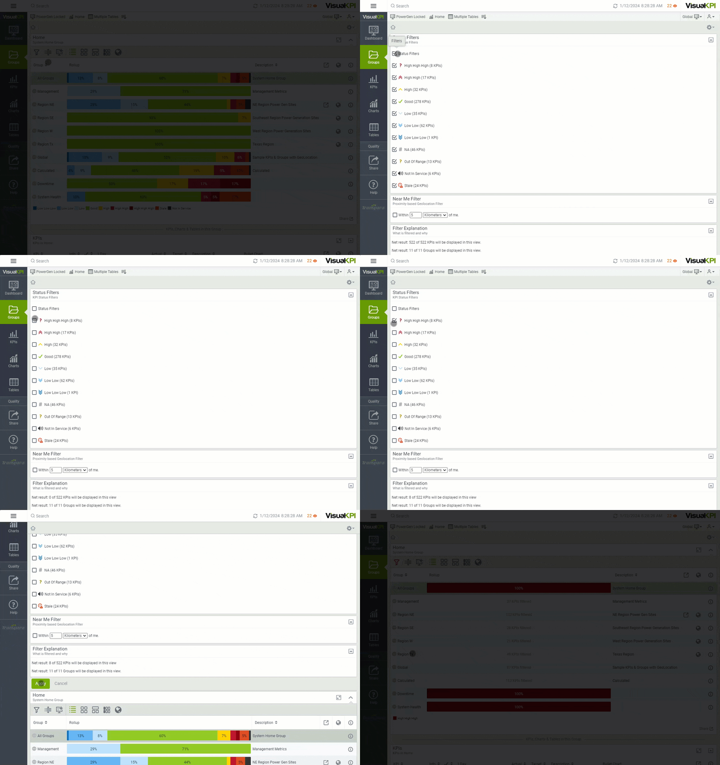
Use the Status Filter to see KPIs with a specific status. For example, you can use this option to see only KPIs with High High High status. To use this filter, follow the steps below.
- Select the Filter icon ().
- Check the status you want to see. For this example, only the High High High status is selected.
- Click Apply.
Near Me filter
Visual KPI can show assets that are geographically located near you. To accomplish this, Visual KPI uses the GPS on your mobile device (or IP address on a non-GPS device, which is less accurate) to filter and sort information based on your current location. This is useful if you want to show only assets within a specific radius of where you are.
If your admin has turned on this feature in the Visual KPI Designer, you can access it via the Filters icon (). The Near Me filter can work with Groups, KPIs, Charts, or Tables. In addition, if the admin enables the feature, you can filter and sort objects by distance and view assets on a map. To use the Near Me Filter, follow the steps below:
- Select the Filter icon ().
- Check the Near Me Filter checkbox.
- Enter the distance you want Visual KPI to search.
- Click Apply.

To use the Near Me Filter, you must permit Visual KPI to access your location. If you're using the application on your smartphone, you will need to enable GPS information. If you're accessing Visual KPI through a web browser, check the Near Me Filter checkbox, and the browser will prompt you to allow Visual KPI to access your location.
Only show descendant/child groups
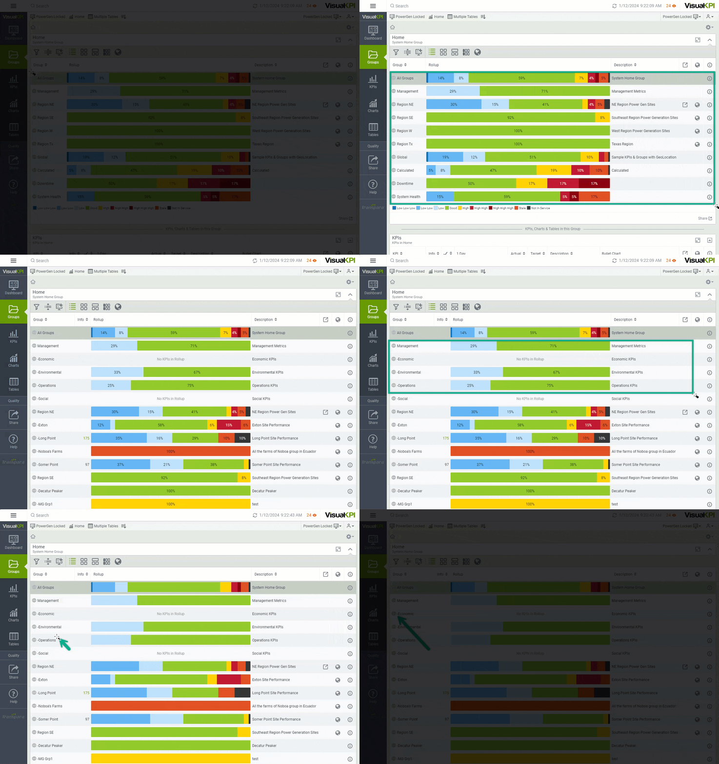
With this option, you can show all child items of the group you are currently viewing or collapse the list to go to the top level of the current list. When you use the Show all Descendant Groups (), all subgroups will show up. On the other hand, when you use the Only Show Child Groups (), only direct subgroups from the current Hierarchy level will be displayed.
In the example below, the Only Show Child Groups () option is active. Thus, only the groups at the top of the Hierarchy are available, and the Management is one of them. When the Show all Descendant Groups () is selected, subgroups show up. You can check the subgroup level by the number of hyphens (-) before the group's name. Thus, you can verify that the Management group has four other subgroups (Economic, Environmental, Operation, and Social).
View as KPI Map
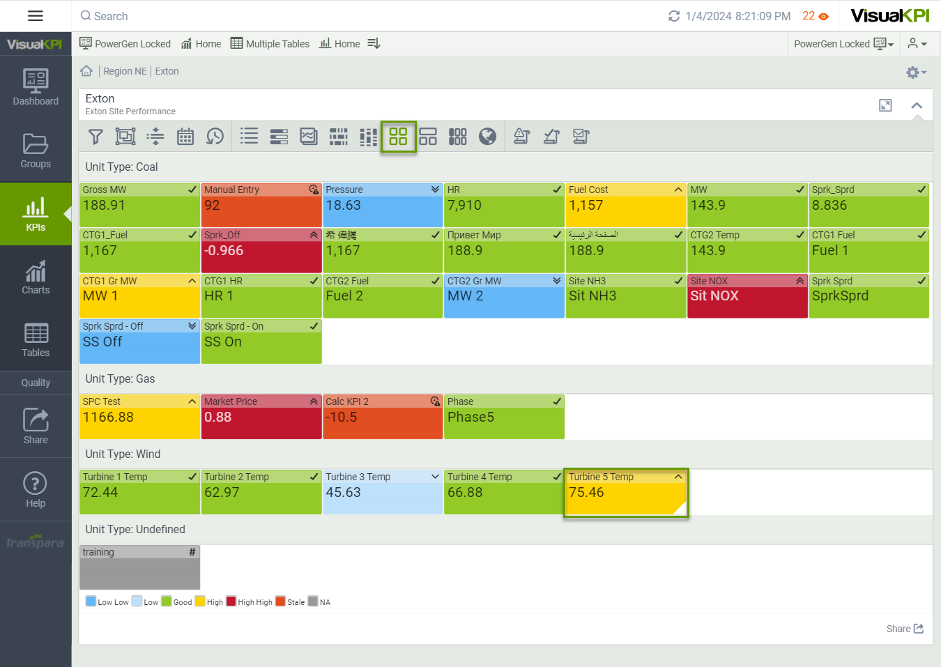
If configured by your admin, the KPI Maps () visualization option enables you to view a graphical heat map of all the KPIs in the level you are currently on. This view adapts to the screen size you are working with and how many KPIs are visible. For example, if you have many KPIs on a small screen, KPI Maps show colored boxes, while fewer KPIs on a larger screen show values on the KPI Maps.
On KPI Maps, the color indicates status. If your KPIs are in critical status, you'll know immediately by the status color. When your screen is large enough to show more details, you'll also see status symbols and values.
The lower right corner of a KPI will warn you when a KPI status has recently changed. The lower-right corner will blink for a few seconds. Then, it will remain a different color for a period, determined by the admin using the Visual KPI Designer.
View as Group Map
The Group Map () view is similar to the View as KPI Map but is more advanced and gives each Group its status. Based on a configurable time limit, they show the KPIs within a group and highlight the worst-performing and recently changed KPIs. In the Visual KPI Group Map, you can quickly see if any KPIs are in alert condition.
The bar across the top of each Group in the Group Map indicates the Group's status as determined by the Group Map settings. You'll see either the most recently changed KPI in the Group, the worst performing KPI in the Group, or any custom status set by your Visual KPI Designer admin. This way, you can quickly see if a group needs attention based on what's happening with critical KPIs or if all of the KPIs in the Group are on target.
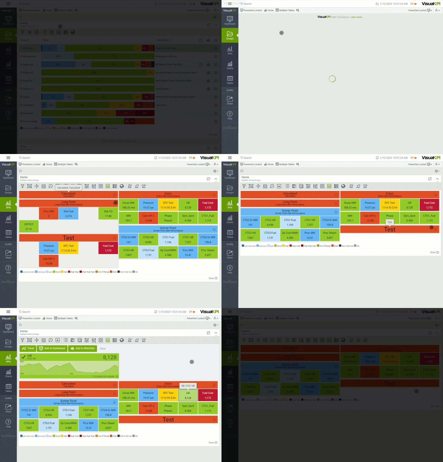
The Group Map view is collapsible. This way, you can collapse an individual group (it will still show the group status) by using the icon in the upper right () of each Group. Alternatively, you can collapse/expand all groups in the view by clicking the same icon ( / ) in the toolbar.
KPIs within a group can be locked into a position, so you always know how individual KPIs are performing at a glance. This view adapts to the screen size you are working with and how many KPIs are visible. For example, if you have many KPIs on a small screen, KPI Maps show colored boxes, while fewer KPIs on a larger screen show values on the KPI Maps.
Select and click any KPI in the Group Map to display details of the KPI above the Group Map. For example, you can click for more information if you see a KPI in an alert. Click the KPI name again to return the selected KPI to the Group Map, or click the trend to go to the full Trend view. Use filters or any trend icons in the toolbar to adjust the trend view.
Group Maps may or may not show up, depending on whether your admin configures them.
View as Group Map table
The Group Map Table () view is similar to the Group Map view but has a different layout. It shows groups as titles in a table. As happens when using the Group Map, you can select and click on any KPI in the Group Map Table to display details and other KPI options.

View as Geo Map
The Geo Map () option combines the latitude and longitude of your assets and Google Maps to create an interactive visualization right inside the Visual KPI. When you select the Geo Map, you can use the Google Maps interactive functionalities to zoom, pivot, or rotate, for example.
In addition to the default Google Maps tools, you can click a set of values on the map to see details. If you are viewing a Geo Map based on groups, you may see a pie chart that sums up everything in that group. Clicking on the pie chart opens details for any groups displayed. You can even use your GPS location or IP address to filter data based on its physical distance from you.
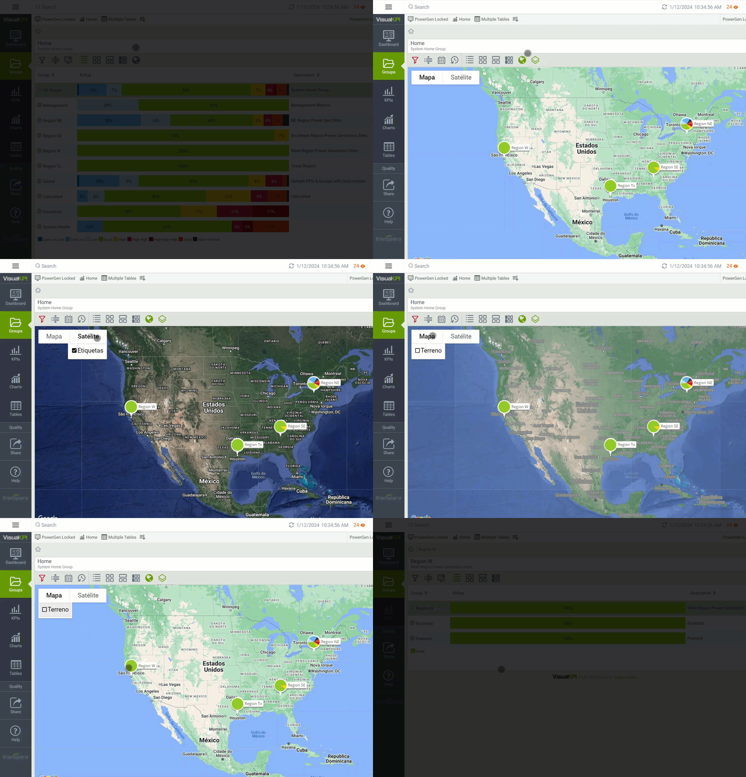
Your admin must configure the Geo Maps visualization to enable the icon () on your Dashboard.
What's next?
Having trouble finding KPIs? Learn how to quickly find any information on Visual KPI by accessing the Search content for Basic Navigation.