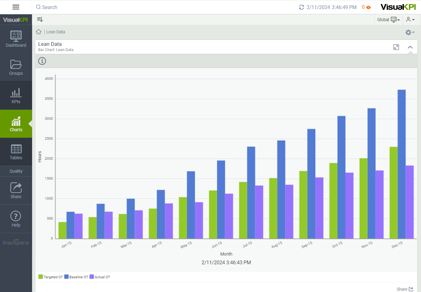
Bar Chart
Bar charts, either vertical or horizontal, can be used to compare data against targets and limits.
You can compare only one specific set of data, where each bar represents the data, or you can cluster sets of data so that each specific set of data has its own bar, but the related sets are clustered and compared against other clustered data.

Define Bar Chart Attributes
After creating and configuring some essential attributes for a chart, you can begin to design its look. Here, we show you the basic attributes that you need to set to design a basic bar chart. To see all possible attributes you can configure, see Charts Attributes & Keywords Reference Guide.
- Bar chart name: Name your chart.
- X and Y axes labels: Name the X and Y axes, as these labels will appear on the chart to identify the data represented.
- Query Chart Type: Decide whether you want to cluster data.
- Chart Orientation: Select either vertical or horizontal orientation.
- Bar name and interface: You can add up to 20 bars. To add data to your chart, you add a value, calculation, and/or interface for each bar. You can also use queries and Connect Strings to connect to an SQL database.
- Info display format: Use the pulldown menu to decide if the data information should be numbers, units of measure, or both.

Design Charts with Targets & Visualizations
You have the option to add targets and baselines to your chart to add more meaning to the data. For example, if you create a chart to show yield for manufacturing plants, you may set a baseline of minimum acceptable yield and a target for expected yield.
Set a Target and Baseline
Targets can be entered as values or returned from an interface. To enter a value, select a previously defined interface using the Target or the Target Interface column.
You can add up to 5 additional lines to each chart.
You can use Formulas and Functions in the Target and Baseline attribute columns.
Give the Target a Name and Color
If you decide to use a Target Name, it will display as a tooltip when you hover over the line in the chart.
Target Color adds color to the Target line. Use the pulldown menu to select a color.
Add Conditional Coloring
Conditional Coloring allows you to change the bar's color above and below the Target line based on the value comparison.
Above Target Color and Below Target Color allow you to select those Conditional Colors, and you can name each in the Above and Below Target Name.
For example, if you set performance targets, you can set the color to green above the target line and use Pass as an Above Target Name.
