XY Plots
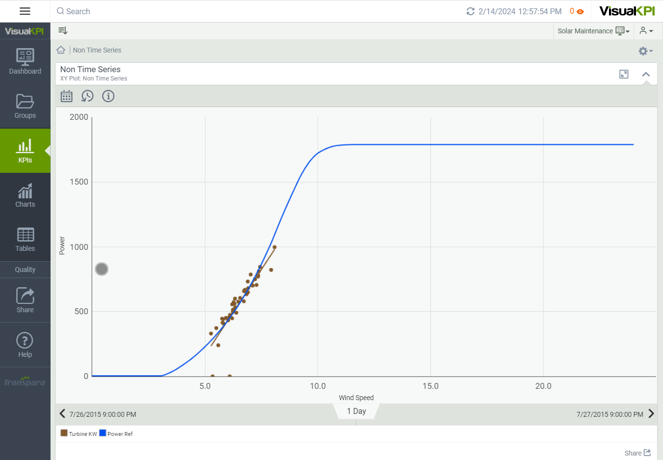
Create and configure XY Plots, or scatter charts, to show the relationships between two data sets. For example, you could show the temperature outside related to the number of ice creams sold. However, measuring wind speed against power might be a better example when using Visual KPI.
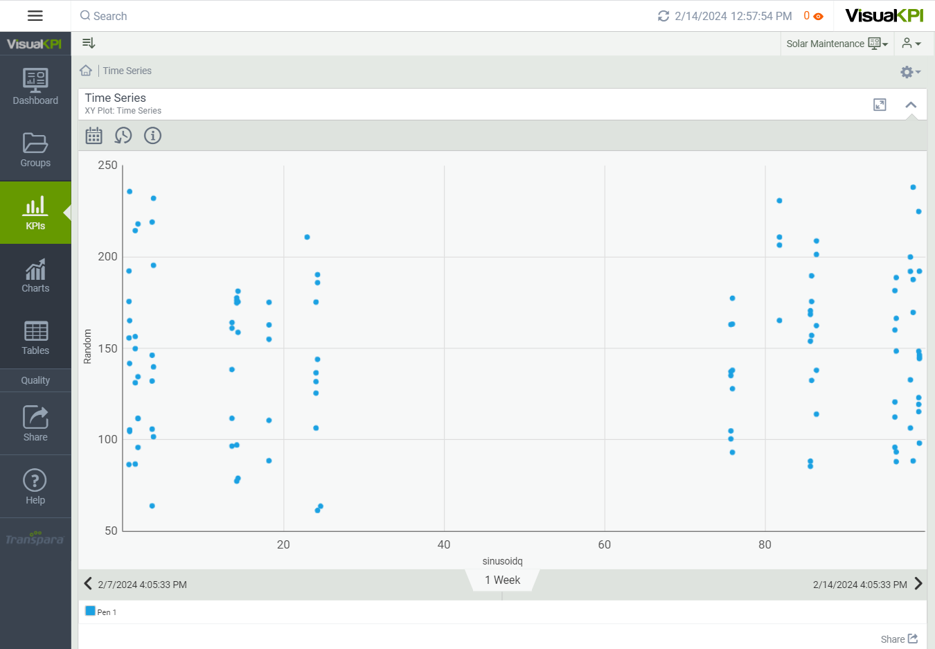
Depending on your data visualization needs, XY plots can be configured to incorporate time as a variable or exclude it.

Define Bar Chart Attributes
After you have created and configured some basic attributes for a chart, you can begin to add data to it. Here, we show you the basic attributes that you need to set to design a basic XY plot. To see all the possible attributes you can configure, see Charts Attributes & Keywords Reference Guide.
Name X and Y Axes
Name the X and Y axes, as these labels will appear on the chart to identify the data represented. For example, the Non-Time Series chart above shows Power and Wind Speed as the X and Y axes.
Enter Values and Interface
Visual KPI uses Pens to display the plot points. To add data to your chart, add a value, calculation, and/or interface for each pen and X and Y points.
You can have up to 20 pens for each chart.

Name and Color Pens
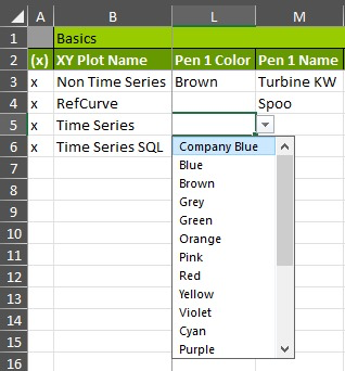
You can select a color using the pull-down menu for each pen on the XY plot. Otherwise, Visual KPI will define the default pen colors.
Then, you can assign a name to each pen to show as a label in Visual KPI. The pen name displays when you hover over it in your Visual KPI chart.

Select Time Series or Not
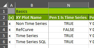
Time series determines how the XY data correlates with the plot. If the time series is set to TRUE, then X values are interpolated to match the X value; otherwise, if set to FALSE, X and Y pairs are determined based on the order in which the interface returns them. Set Time Series to TRUE or FALSE for each pen on the XY plot.

Add Fit Line to Plot Contents
If you want your XY plot to show linear regression, you can plot a fit line and select which data the line should follow. A fit line can help you see whether two sets of data correlate and can be used to help identify trends within the data.
The fit line is set to plot the Y data in the Non-Time Series XY plot at the top of this page. In Visual KPI Designer, use the Plot Contents attribute to set the Fit Line for each pen.
Select Default Start/End Times and Interface
For each XY plot, you can choose to return data from an interface and select the default start and end times you want to show to users on your Visual KPI site.
Remember, you can use the Time Range selector () in Visual KPI sites to change the time ranges shown on a chart. The time range can be changed to show data as far back as it exists.
