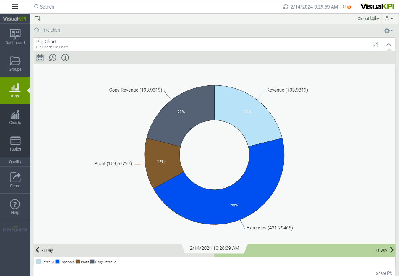
Pie Chart
Pie charts are a straightforward representation of data. They provide a clear and simple graphical representation of the relative proportions of your compared assets.

Define Bar Chart Attributes
After you have created and configured some basic attributes for a chart, such as the chart name, description, groups, and display order, you can begin to design the “look” of the chart. Here, we show you the basic attributes that you need to set to design a basic pie chart. To see all the possible attributes you can configure, see Charts Attributes & Keywords Reference Guide.
Label and Color Pie Chart Slices
Start by naming each slice in your pie chart. You can have up to 20 slices in each pie chart.
If you leave the slice color blank, Visual KPI will select colors, or you can customize the color of each slice of pie.
Enter Values and Interface
To add data to your chart, add a value, calculation and/or interface for each bar.
