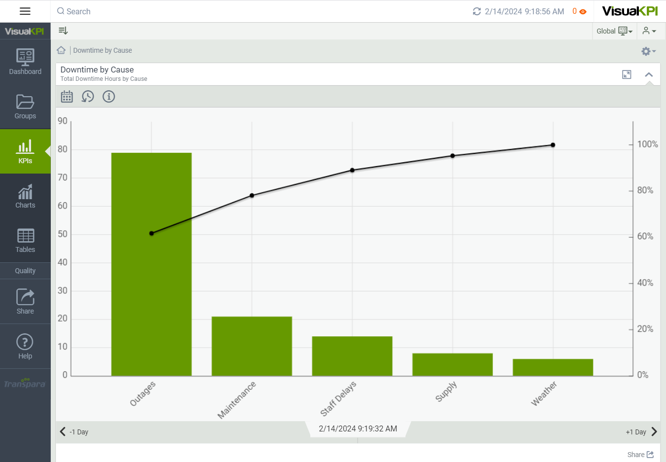
Pareto Chart
Pareto charts can help you quickly see which assets are most critical and know where to focus. You could configure Pareto charts for quality control to show where most problems come from. For example, if you create a Pareto chart for Plant Yield, you can quickly see which plant is causing your overall numbers to fall.
Pareto charts show assets and values in the bars and use a line to show cumulative effect.

Define Pareto Chart Attributes
After creating and configuring some basic attributes for a Pareto chart, such as the name, description, and display order, you can begin to describe the data that will build the chart. Here, we show you the basic attributes that you need to set to design a basic Pareto chart. To see all the possible attributes you can configure, see Charts Attributes & Keywords Reference Guide.
Name X and Y Axes
Name the X and Y axis, as these labels will appear on the chart to identify the data represented.
Create & Name Bars
You can add up to 20 bars to your Pareto chart. Give a label to each bar.
Enter Values and Interface
To add data to your chart, add a value, calculation and/or interface for each bar. You can also add Connect Strings.
Select Bar Colors
You can select the color for each bar, or you can leave the attribute blank, and Visual KPI will select the default colors.
