Query Based Chart
There are two ways to create charts in Visual KPI: via an interface or query-based charts.
Create charts via an Interface
Using Visual KPI Designer, you can enter a set of lookup/interface pairs. (These lookups can also come via Remote Context Server). For example:

This creates a chart (Bar chart in this example) that shows the values of the resulting data returned for Bar 1 and Bar 2 at a moment in time. This chart can be scrolled back and forth in time but will always show values at the particular time selected by the end-user on your Visual KPI site. The same method can be used for Bar Charts, Pareto Charts and Pie Charts (or new chart types we might add occasionally). This is a quick way of showing data with minimal configuration effort.
Create query-based charts
Another method for creating charts is to use SQL queries. We refer to these as Query-Based Charts.
You may choose to use query-based charts for simplicity. If the data needed for a chart already exists in a database, you may spend more time setting up an interface to extract a time/value pair per bar, and in some cases, this method may not perform well.
Data historians, such as OSIsoft's PI System, Aspentech, GE, Aveva/Wonderware, and others, lend themselves really well to the lookup/interface pair as there is often no schematic correlation of data points. However, in relational database systems, such as SQL Server or Oracle, these relationships are often explicitly defined in the data itself, making using the query-based charts approach more convenient.
Also, query-based charts must be used if you want to do any of the following:
Create Ranged-based charts
Instead of a bar or pie slice representing a value at a single point in time, each bar or slice would represent data over a time range. This is useful for charts showing things like outages over a week, production totals per day, or monthly incidents. The idea is to write a query aggregating data over a time range (defined at design time and overridable at run time).
Create Stacked or Clustered Bar charts
Create a series of values, such as production totals per day per factory or incidents per month per region. Stacked and Clustered bar charts can be range-based or time-based, but either case will require a query-based approach.
An example scenario using query-based charts
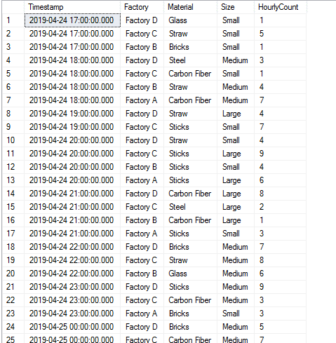
Let's take a look at the following sample data. In this example, we are manufacturing widgets. They come in three sizes (small, medium and large) and are made from one of six different materials (straw, sticks, bricks, glass, steel and carbon fiber). We have four factories (Factory A, Factory B, Factory C, and Factory D), and each factory produces a number of widgets of a certain size and material each hour. The hourly output of these factories is recorded in a table (tableWidgetProduction).
This table has the following fields: Timestamp (datetime), Factory (nvarchar), Material (nvarchar), Size (nvarchar) and HourlyCount (int). The results of a simple select * query are shown below. This is just a select top N result, as the table has much more data.
Query-based charts: types
Visual KPI Chart queries come in 2 types: basic and series-based. Basic queries can be used in Bar Charts, Pareto Charts and Pie Charts, while series-based queries can only be used in Bar Charts (set to Clustered or Stacked).
Query-based charts: parameters
Visual KPI Chart queries can optionally use a TIMESTAMP parameter, STARTDATE and ENDDATE parameters or no parameters. These date-based parameter keywords will have dates substituted at runtime to allow for time-based (user-selected) charts.
Here's an example query:
select sum(HourlyCount) as Value

from tableWidgetProduction

where Timestamp between {STARTDATE} and {ENDDATE}

and [Timestamp] <= getdate() — prevent future data

group by Material

order by Material
At Runtime, the {STARTDATE} and {ENDDATE} placeholders will be replaced by valid datetime strings and will result in a query that looks like this:
select sum(HourlyCount) as Value

from tableWidgetProduction

where Timestamp between ‘2019-04-01 01:15:00’ and ‘2019-04-07 15:22:11’

and [Timestamp] <= getdate() — prevent future data

group by Material

order by Material
Basic queries
At its most basic, Visual KPI looks for a column called Value that should hold the data for each bar (Bar Chart and Pareto Chart) or slice (Pie Chart).
Given the query above, the resulting dataset and chart would look like this:

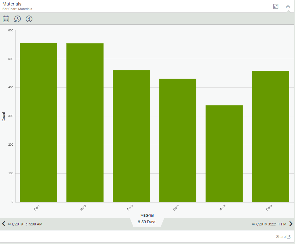
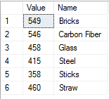
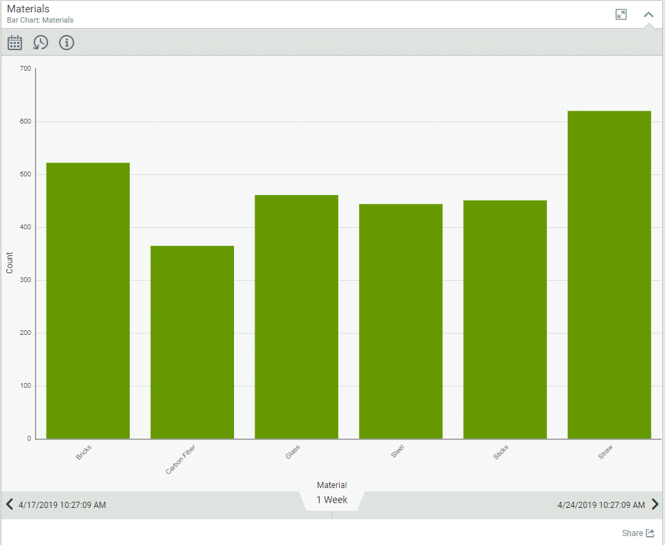
In order to give the chart bars names, the query needs to also return a Name field:
select sum(HourlyCount) as Value,

Material as Name

from tableWidgetProduction

where Timestamp between {STARTDATE} and {ENDDATE}

and [Timestamp] <= getdate() — prevent future data

group by Material

order by Material
Here's the result of this query and the corresponding chart:
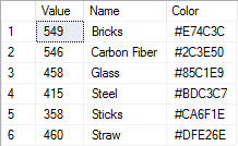
Finally, you can add some color to this chart by adding a Color field to the query:
select sum(HourlyCount) as Value,

Material as Name,

case when (Material = ‘Straw’) then ‘#DFE26E’

when (Material = ‘Sticks’) then ‘#CA6F1E’

when (Material = ‘Bricks’) then ‘#E74C3C’

when (Material = ‘Glass’) then ‘#85C1E9’

when (Material = ‘Steel’) then ‘#BDC3C7’

else ‘#2C3E50’

end as Color

from tableWidgetProduction

where Timestamp between {STARTDATE} and {ENDDATE}

and [Timestamp] <= getdate() — prevent future data

group by Material

order by Material
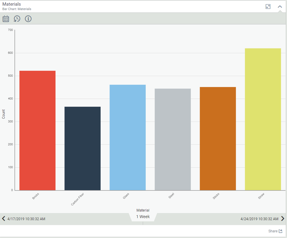
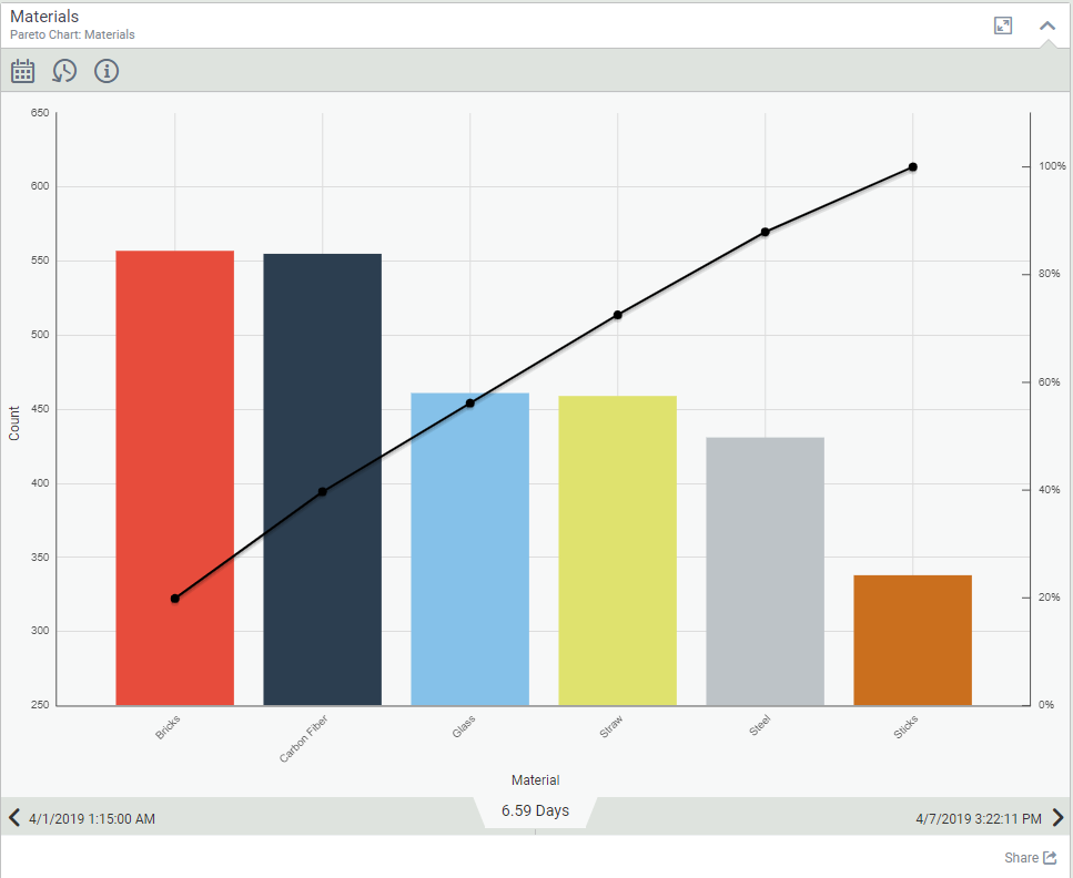
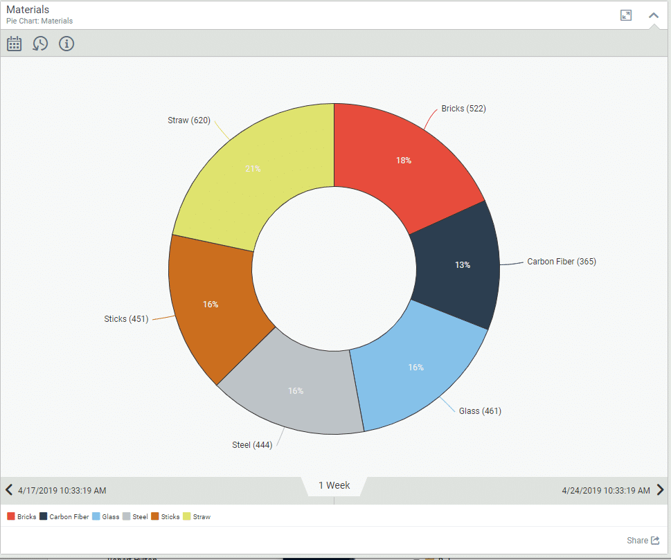
Which results in the following data and chart (as bar, pareto and pie charts):
Series-based queries
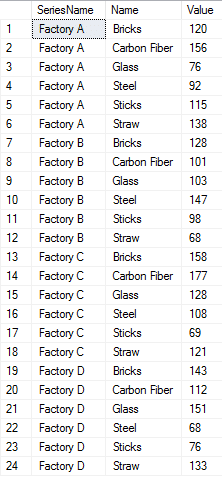
To create a series-based Bar Chart (Clustered or Stacked), you need to return a SeriesName, Name and Value column:
select Factory as SeriesName,

Material as Name,

sum(HourlyCount) as Value

from tableWidgetProduction

where Material is not null

and Timestamp between {STARTDATE} and {ENDDATE}

and [Timestamp] <= getdate() — prevent future data

group by Material, Factory
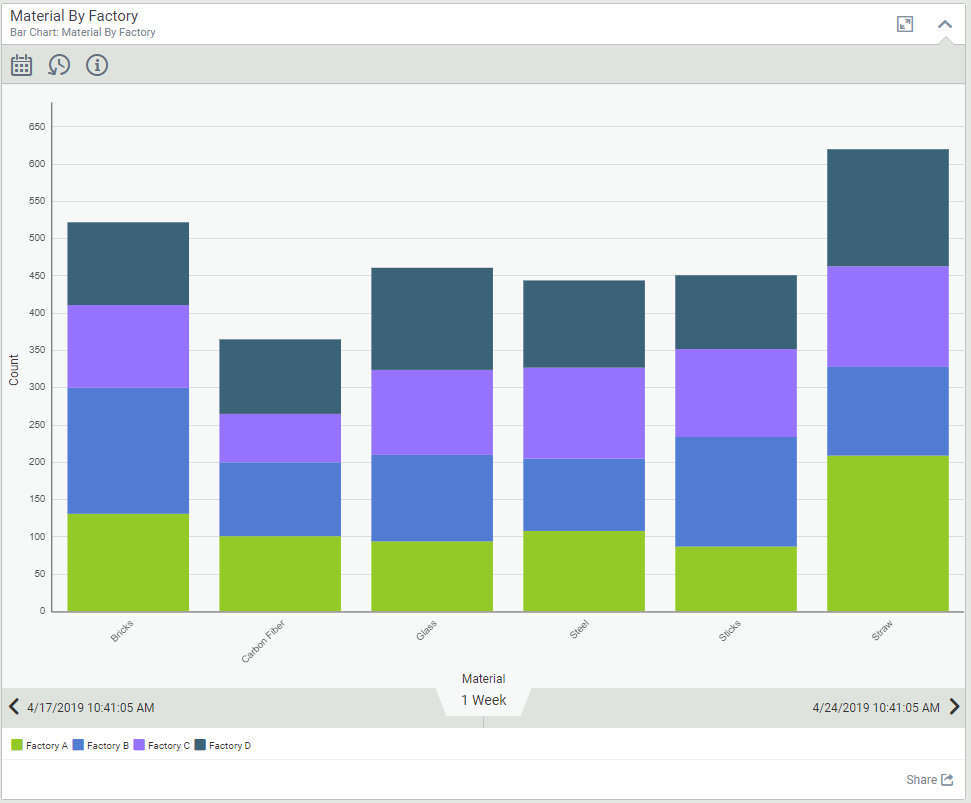
This results in the following data and chart:
The Bar Chart is set to Stacked in Visual KPI Designer, but the exact same query would work if the Bar Chart were set to Clustered.
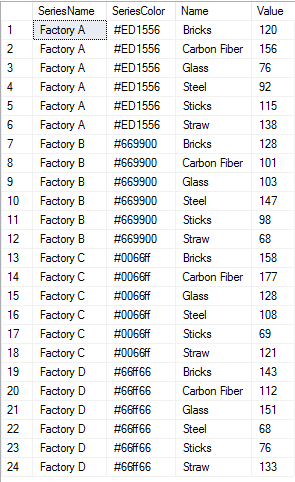
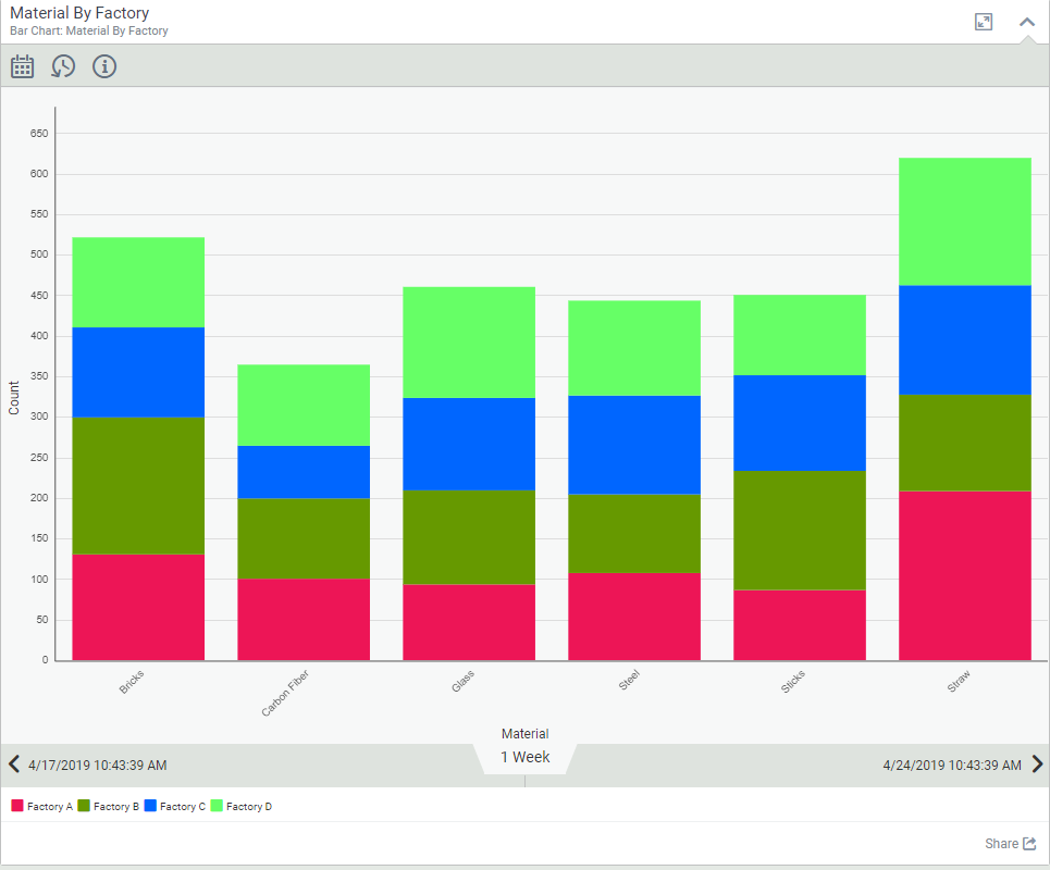
To control the series colors, simply add a column called SeriesColor to the results as follows:
select Factory as SeriesName,

case

when Factory = ‘Factory A’ then ‘#ED1556’

when Factory = ‘Factory B’ then ‘#669900’

when Factory = ‘Factory C’ then ‘#0066ff’

when Factory = ‘Factory D’ then ‘#66ff66’

else null

end as SeriesColor,

Material as Name,

sum(HourlyCount) as Value

from tableWidgetProduction

where Material is not null

and Timestamp between {STARTDATE} and {ENDDATE}

and [Timestamp] <= getdate() — prevent future data

group by Material, Factory
This results in the following data and chart:
To change the chart to Clustered, use Visual KPI Designer to set the Query Chart Type to Clustered:

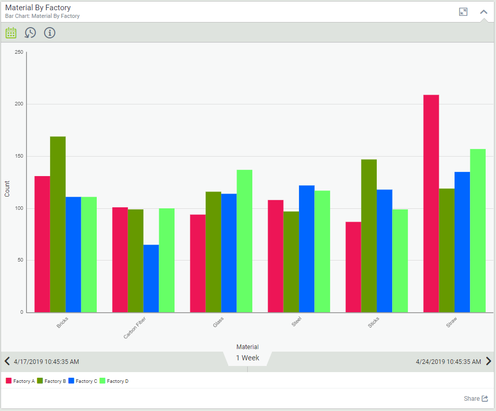
With these two approaches to chart creation, you can create many interesting visualizations. Please don't hesitate to contact our support team if you have any questions.